Why Brand Consistency Matters More as a Company Grows
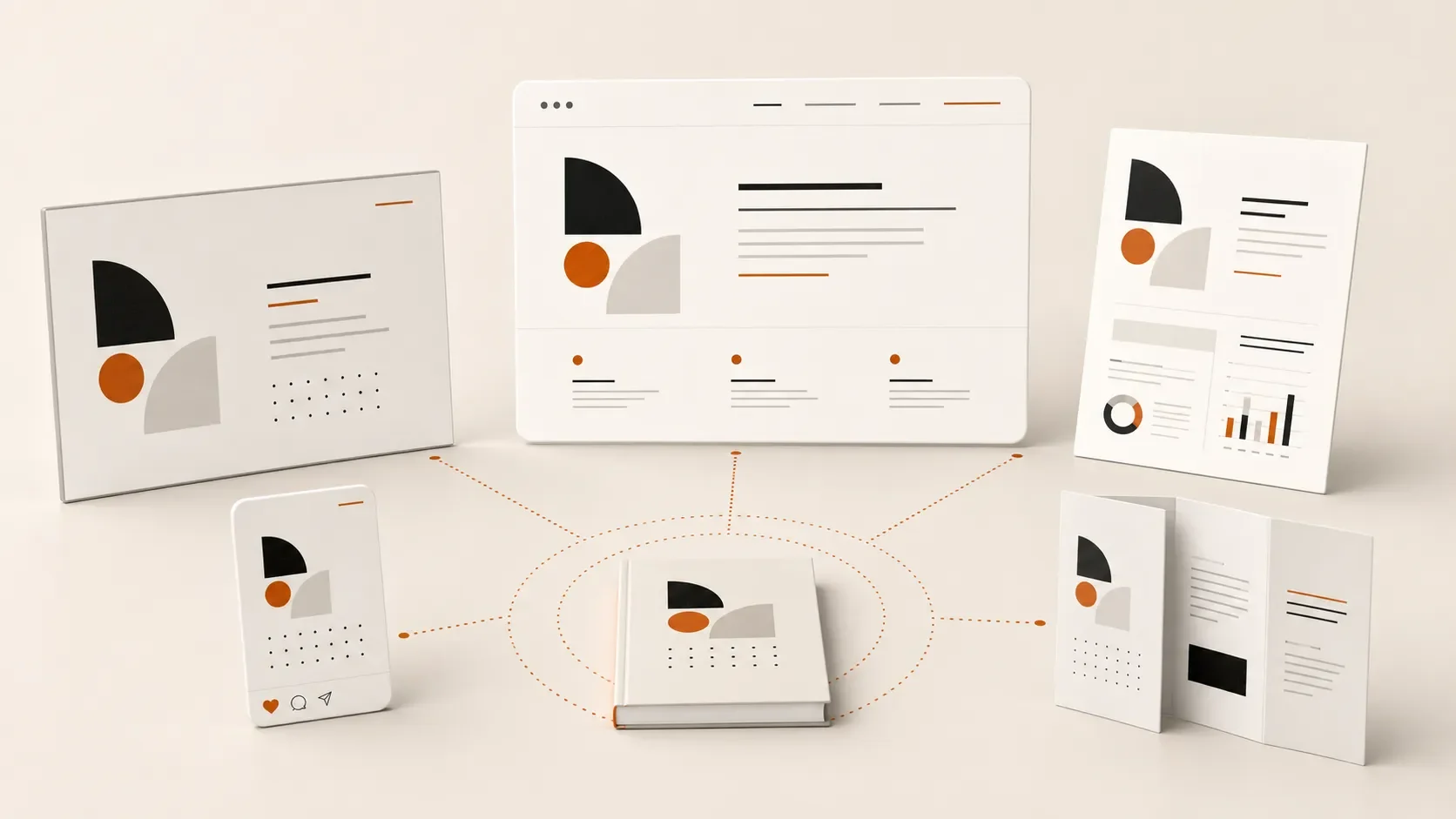
As a company grows, more people create presentations, web pages, social graphics, and sales materials. A scalable brand system protects customer trust while helping teams work faster and more consistently.
Brand consistency is relatively easy when a company is small. A founder approves every presentation, one designer creates most of the marketing materials, and everyone knows which logo file to use.
Growth changes that.
More employees, departments, vendors, platforms, and sales opportunities mean more people are representing the brand. Without a clear visual system, small inconsistencies quickly multiply. The website follows one style, sales presentations follow another, and social graphics depend on whoever created the most recent template.
These differences may seem minor individually. Together, they can weaken trust, slow teams down, and make an established company appear less organized than it really is.
What Is Brand Consistency?
Brand consistency means presenting the same recognizable identity across every customer interaction.
This includes more than using the correct logo. It also involves:
Color
Typography
Photography
Illustration
Layout
Messaging
Presentation templates
Website components
Social media graphics
Sales and marketing materials
Consistency does not mean every piece of communication must look identical. It means everything should feel like it came from the same organization.
A flexible brand system can support different audiences, campaigns, and formats while maintaining a clear visual connection between them.
Why Does Growth Make Brand Consistency Harder?
As a company grows, control becomes distributed.
The marketing team may manage the website. Sales representatives create their own presentations. Human resources develops recruiting materials. An outside agency launches a campaign. A freelance designer produces an event banner. Leadership occasionally builds its own documents.
Each contributor may make reasonable design decisions. The problem is that those decisions are often made independently.
Without shared guidelines, approved templates, and an organized asset library, employees fill the gaps themselves. They choose a similar font, approximate a brand color, stretch an old presentation into a new format, or download the first logo they can find.
The result is rarely one dramatic brand failure. It is a gradual collection of small inconsistencies.
How Inconsistency Can Weaken Trust
People use visual signals to decide whether an organization feels credible and established.
Imagine a prospective client visits a polished website and then receives a sales presentation that looks several years out of date. The information may be accurate, but the difference creates friction. The prospect may wonder which version of the company is current or whether the organization pays attention to details.
The same disconnect can happen between social media and the website, between a trade show booth and its supporting handouts, or between marketing materials created by different departments.
Customers may not identify the exact font, color, or spacing that changed. They simply notice that something feels disconnected.
Consistent design creates familiarity. Familiarity makes a company easier to recognize, understand, and trust.
The Hidden Cost of Recreating Materials
Brand inconsistency is also an operational problem.
When employees do not have reliable templates or know where approved assets are stored, they spend time solving the same design problems repeatedly.
A salesperson rebuilds a pitch deck because the existing version is difficult to edit. A marketing coordinator searches through folders for the current logo. A new employee creates a social graphic from scratch because no usable template exists. A designer corrects basic brand issues instead of focusing on more valuable creative work.
This produces a cycle of unnecessary decisions, revisions, and approvals.
A strong brand system reduces that work. It gives people a reliable starting point, allowing them to create materials faster without reinventing the brand each time.
Why a Logo and Color Palette Are Not Enough
Many growing companies have basic brand guidelines covering logo usage, colors, and fonts. That is a useful foundation, but it may not provide enough direction for everyday work.
Teams need to see how the identity applies to real situations.
Useful brand guidelines might include examples for:
Presentation slides
Social media posts
Sales sheets
Reports
Email graphics
Digital advertising
Event materials
Website pages
Charts and data visualization
Photography selection
Templates are especially important. Guidelines explain the system, while templates help people use it.
The goal is not to restrict every decision. It is to make the correct decision easier.
What a Scalable Brand System Includes
A scalable brand system combines standards, tools, and examples that different teams can use confidently.
Depending on the organization, that system may include:
A complete set of logo files
Defined colors and typography
Clear visual hierarchy
Photography and illustration direction
Flexible layout principles
Presentation and document templates
Social and campaign templates
Reusable website components
An organized asset library
Practical brand guidelines
A process for reviewing new materials
The system should be detailed enough to maintain consistency but simple enough that people actually use it.
If every routine decision requires a designer’s approval, the system is too restrictive. If employees still have to guess, it is not complete enough.
How to Improve Brand Consistency
Audit the Most Visible Materials
Start with the places customers interact with the brand most frequently. Review the website, sales presentations, proposals, social channels, email campaigns, event materials, and recruiting documents.
Look for differences in typography, color, imagery, layout, messaging, and overall quality.
Identify Repeated Problems
Some inconsistencies are symptoms of a larger operational issue. If every salesperson uses a different deck, the answer may be a flexible presentation system rather than another round of individual corrections.
Prioritize the materials that are frequently created, widely distributed, or closely connected to revenue.
Create Practical Guidelines
Document the decisions employees make in their actual work. Show examples instead of relying only on abstract rules.
A useful guide should help someone complete a task, not simply describe the brand.
Build Reusable Templates
Create approved starting points for common materials. Templates reduce production time while leaving enough flexibility for different content and audiences.
Establish Clear Ownership
Someone should be responsible for maintaining the system, updating templates, organizing assets, and answering brand questions. This does not require controlling every execution, but it does require a clear source of truth.
Brand Consistency Is Infrastructure for Growth
Brand consistency is sometimes treated as a cosmetic concern. In practice, it affects how a company is perceived and how efficiently its teams operate.
A well-designed system helps an organization:
Build recognition across channels
Present a more credible and established image
Reduce unnecessary design decisions
Create materials more efficiently
Onboard employees and vendors faster
Maintain quality as output increases
The value of a brand system becomes more visible as the company grows. What once lived naturally in the founder’s head must eventually become a shared set of tools that other people can understand and use.
Growth introduces complexity. A consistent brand system keeps that complexity from becoming confusion.
Frequently Asked Questions
Does brand consistency mean everything must look the same?
No. A strong identity should be flexible enough to support different formats, messages, and audiences. Consistency comes from shared visual principles, not identical layouts.
When should a company update its brand guidelines?
Guidelines should be reviewed when the organization adds new services, enters new markets, redesigns its website, works with more outside partners, or finds that employees frequently create inconsistent materials.
Who should be responsible for brand consistency?
Ownership often sits with marketing or creative leadership, but every department that creates external communication plays a role. Clear standards and templates make shared responsibility possible.
Can templates solve every consistency problem?
Templates help, but they work best as part of a broader system. Teams also need organized assets, relevant examples, clear guidance, and someone responsible for maintaining them.
Key Takeaway
The more people who communicate on behalf of a company, the more important a shared visual system becomes.
Brand consistency protects trust, reduces wasted time, and gives teams the tools to create effective materials without starting from scratch. It is not about controlling every design decision. It is about helping a growing organization continue to look and communicate like one company.
How Do You Design a Brand for a Global Audience?
What the FIFA World Cup 2026 identity can teach every organization about designing for multiple languages, cultures, and billions of people.
Key Takeaways
Global brands must work across multiple languages, writing systems, and cultures.
Typography is one of the most important decisions in an international brand system.
Successful identities perform consistently across digital, print, merchandise, signage, and broadcast.
Accessibility, production methods, and technology limitations influence design decisions.
Strong brand systems solve practical problems before they create visual excitement.
Introduction
When most people see a global brand launch, they notice the logo.
Designers see something much bigger.
Events like the FIFA World Cup 2026 require visual identities that work across three countries, sixteen host cities, dozens of languages, countless production methods, and billions of viewers. The logo is only one small part of a much larger system designed to communicate consistently under almost any condition.
Whether you're branding a local business or one of the world's largest sporting events, many of the same design principles apply.
Why Is Designing for a Global Audience So Challenging?
A local business may have one website, one language, and a handful of marketing materials.
A global event operates on an entirely different scale.
The FIFA World Cup 2026 identity needs to appear consistently across stadium signage, broadcast graphics, merchandise, mobile apps, social media, transportation systems, security credentials, tickets, volunteer uniforms, sponsor activations, and city wayfinding. Every application introduces different technical and environmental constraints.
The challenge isn't creating something that looks impressive in a presentation. It's creating something that works everywhere.
Why Typography Matters More Than Most People Realize
Most people associate branding with logos.
For international organizations, typography often does much more of the heavy lifting.
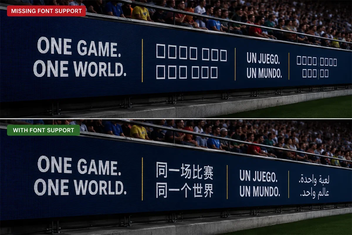
A global typeface needs to support multiple writing systems, hundreds of characters, accent marks, and special symbols while remaining legible across digital and physical environments.
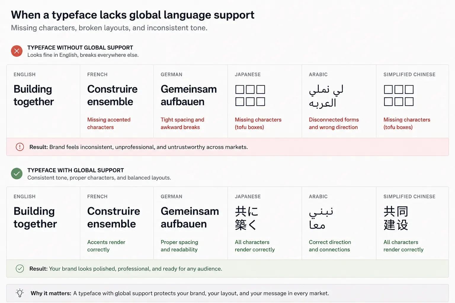
It also needs to account for language expansion. A headline that fits neatly in English may require significantly more space in German, French, or Spanish. In other regions, text may flow in entirely different directions or require completely different character sets.
Good typography creates consistency long before anyone notices it.
Why Every Surface Matters
A successful identity isn't designed for one application.
It's designed for thousands.
The same visual system must perform equally well on:
Stadium scoreboards
Mobile apps
Television broadcasts
Embroidered apparel
Security credentials
Printed tickets
Vehicle graphics
Building signage
Social media
Merchandise
Each surface changes how people experience the brand. The identity needs to remain recognizable whether it's viewed from 300 feet away or held in someone's hand.
Designing for Different Levels of Technology
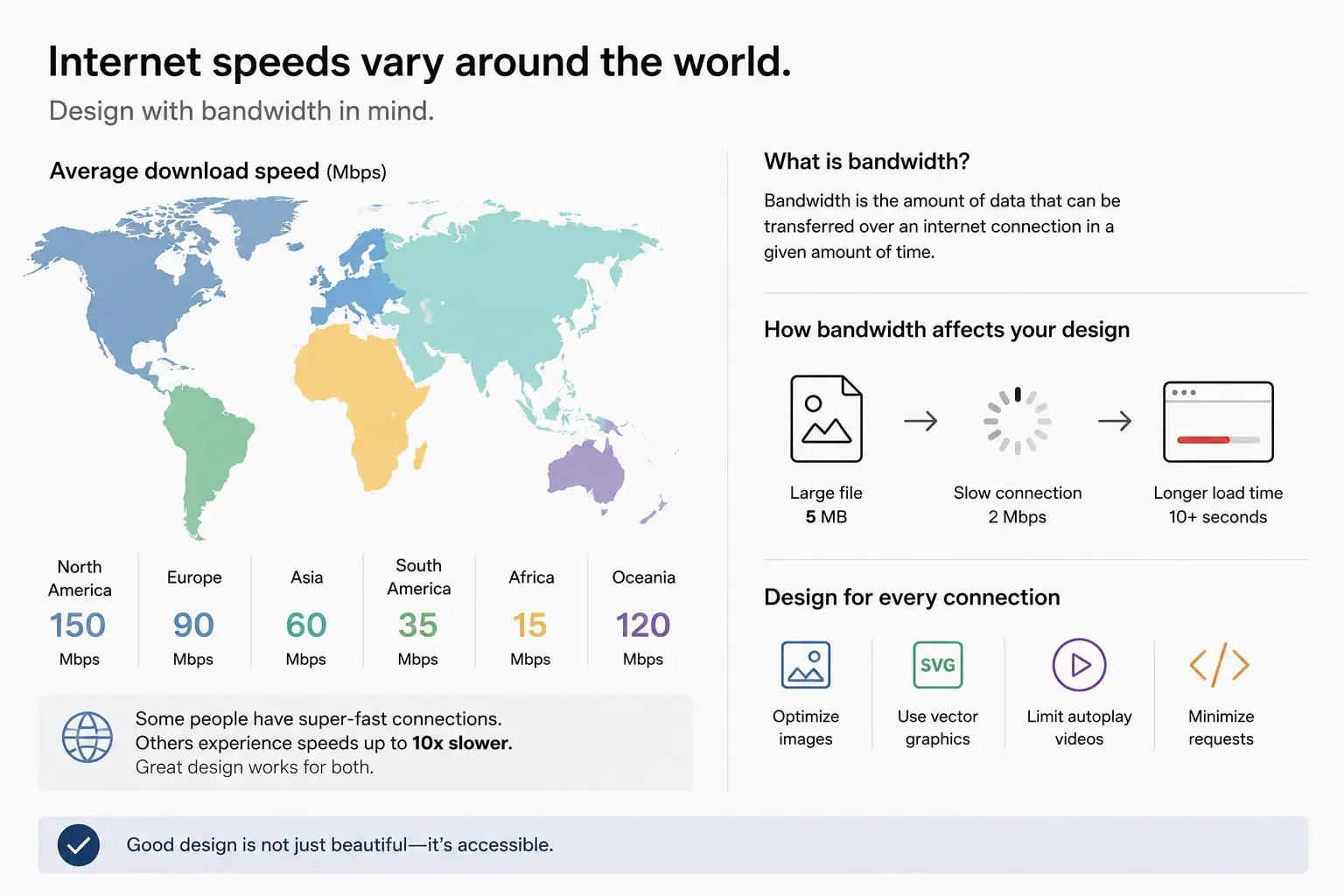
One challenge that rarely gets discussed is technology itself.
Not every fan watches matches on a 4K television or the latest smartphone connected to high speed internet.
Many people experience international events through older mobile devices, slower cellular networks, compressed social media images, or public displays with limited resolution.
These realities influence design decisions.
Simpler graphics load faster. Clear typography remains readable after image compression. Lightweight digital assets improve accessibility for audiences around the world.
Sometimes simplicity isn't an aesthetic choice. It's a performance requirement.
Accessibility Is Part of Good Design
Global brands don't design for an average user.
They design for everyone.
That means considering:
Color contrast
Minimum type sizes
Readability at distance
Color blindness
Motion sensitivity
Clear iconography
Legible wayfinding
Digital accessibility standards
Accessibility improves the experience for every audience, not just those with specific needs.
Consistency Across Thousands of Contributors
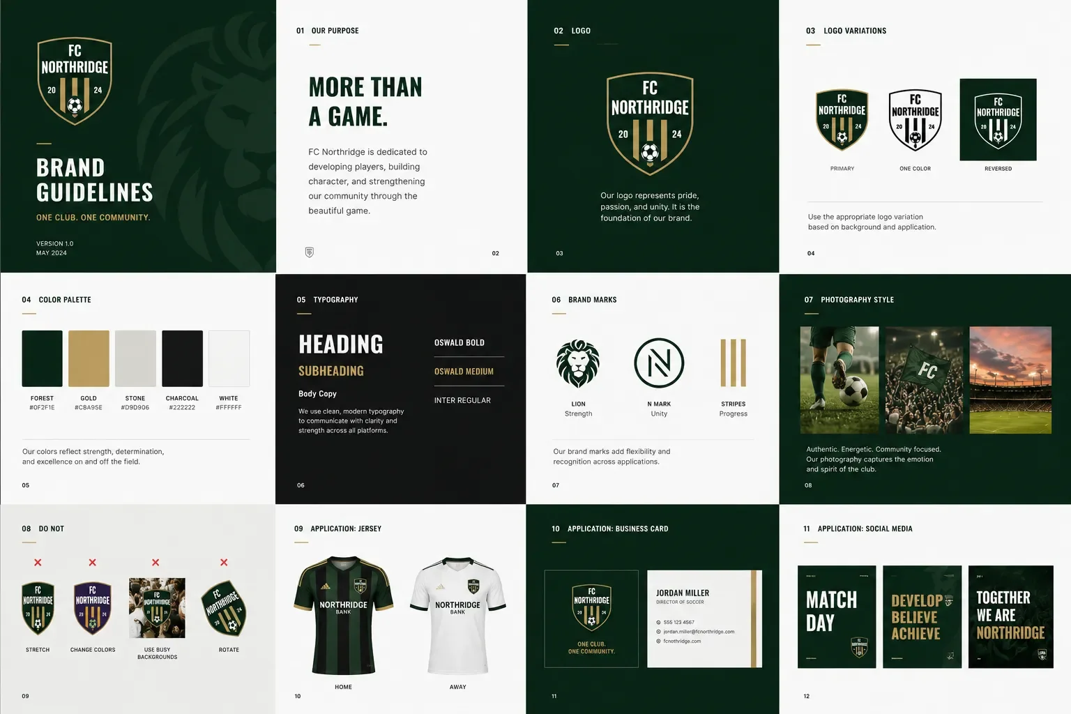
One design team doesn't create every World Cup asset.
Eventually, the brand is used by host cities, broadcasters, sponsors, printers, merchandise vendors, volunteers, venue operators, and marketing teams around the world.
Without a strong design system, consistency quickly disappears.
That's why successful global brands invest as much in standards, templates, and documentation as they do in creative exploration.
A well designed system empowers thousands of people to create work that still feels like one brand.
What Businesses Can Learn from FIFA World Cup 2026
Most organizations don't need to communicate across dozens of languages or hundreds of venues.
But they do face similar challenges at a smaller scale.
As companies grow, their brands appear on websites, proposals, presentations, trade shows, social media, email campaigns, signage, sales materials, and internal communications. Without a cohesive visual system, those experiences begin to feel disconnected.
The lesson isn't to design like FIFA.
The lesson is to build a brand that can grow without losing consistency.
Frequently Asked Questions
What makes a global brand successful?
A successful global brand communicates consistently across languages, cultures, media, and production methods while remaining recognizable in every application.
Why is typography important in international branding?
Typography must support multiple languages, maintain readability across different devices and print methods, and accommodate varying text lengths without breaking layouts.
Why are many global logos relatively simple?
Simple marks are easier to reproduce across signage, apparel, digital platforms, merchandise, and broadcast graphics while remaining recognizable at any size.
What is a brand system?
A brand system is the collection of visual elements, rules, templates, and guidelines that ensure a brand is applied consistently across every touchpoint.
Final Thoughts
The FIFA World Cup 2026 identity isn't remarkable because of a single logo.
It's remarkable because it solves an incredibly complex communication challenge.
Designing for billions of people requires clarity, flexibility, and consistency across languages, technologies, cultures, and environments. Those same principles apply to organizations of every size.
The strongest brands aren't the ones with the cleverest logos. They're the ones that continue to work wherever people encounter them.
America250 Shows the Difference Between a Logo and a Brand System
America 250 is more than a milestone. It is an opportunity to reflect on the people, places, and stories that have shaped our nation. Thoughtful branding and visual design can help communities commemorate this historic anniversary while creating experiences that inspire pride, participation, and connection for generations to come.
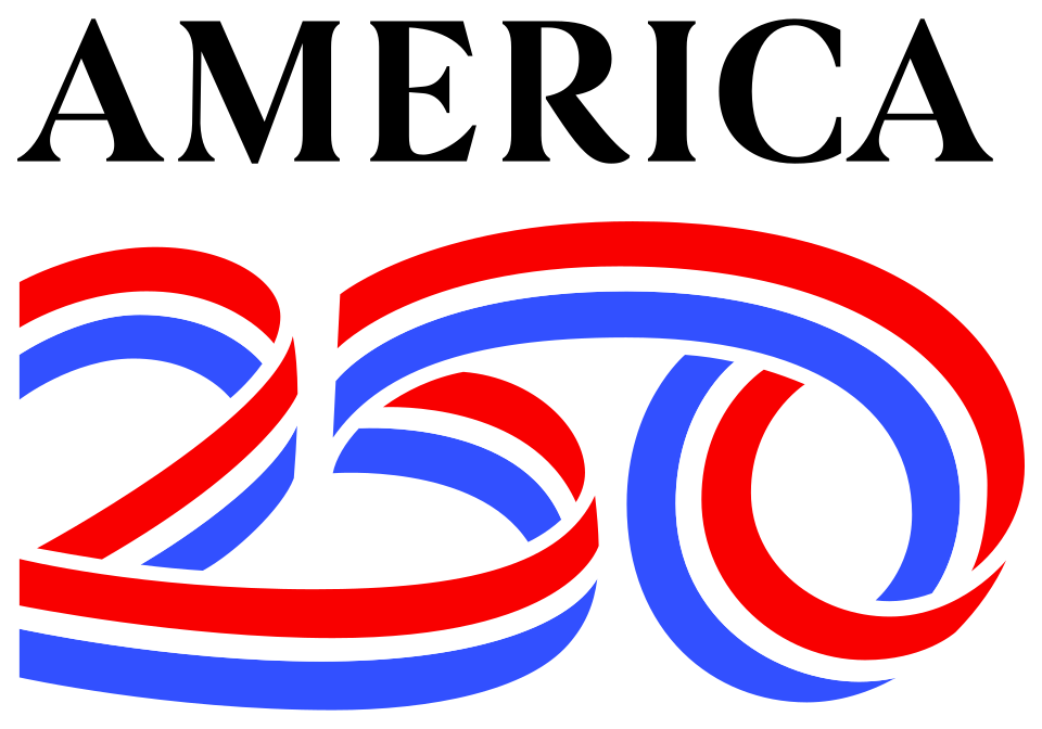
When a project spans an entire nation, hundreds of organizations, and years of implementation, a good logo simply isn't enough. The identity has to work everywhere, across every medium, while remaining instantly recognizable no matter who is creating the next piece of communication.
That is exactly what makes the America250 identity so successful.
Designed by Chermayeff & Geismar & Haviv, the visual identity for the United States' 250th anniversary celebration has generated plenty of conversation since its launch. While public discussion often centers on whether someone likes the logo itself, that question misses the bigger achievement. The real success isn't the mark. It's the design system built around it.
Looking Beyond the Logo
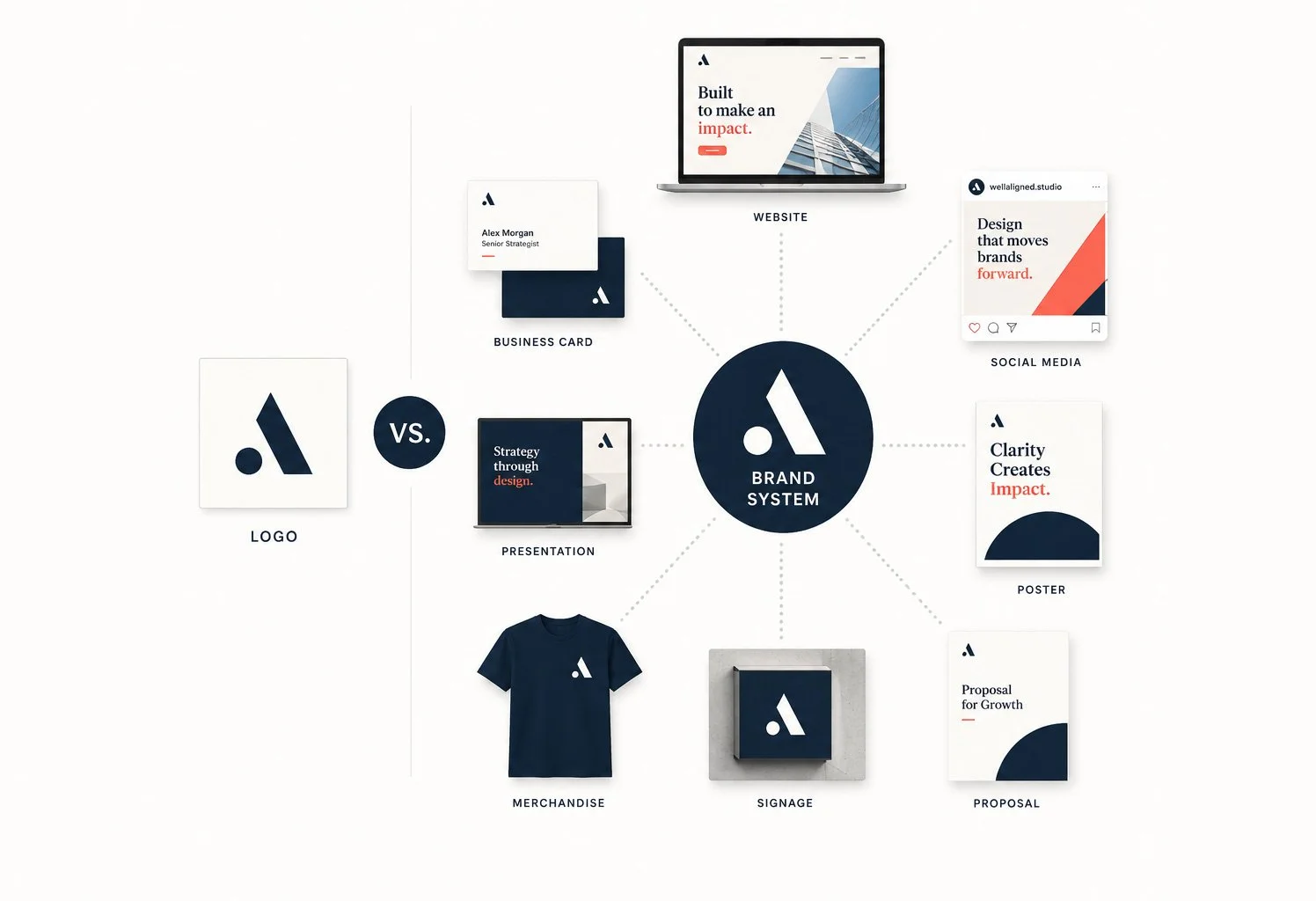
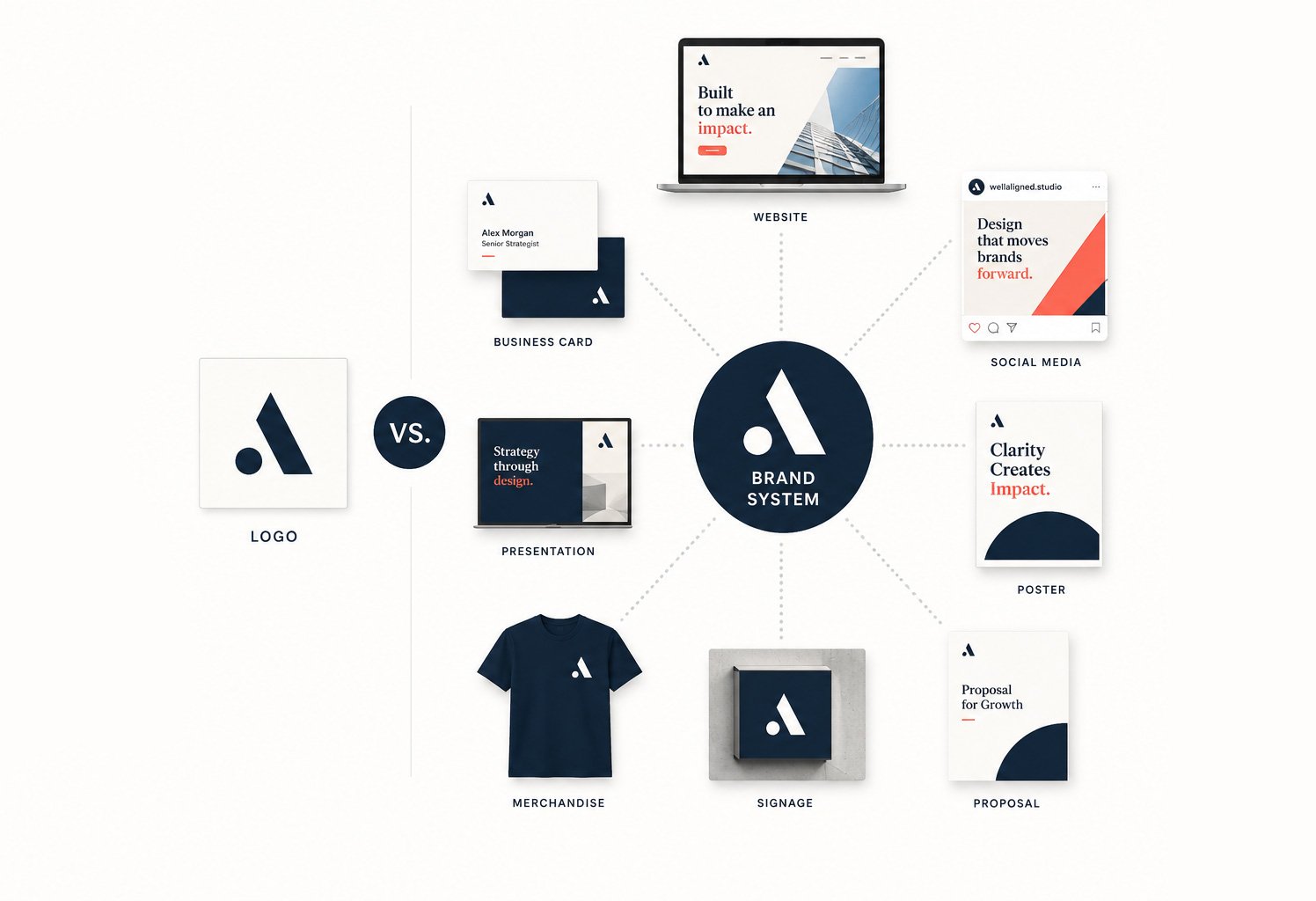
As designers, it's easy to appreciate a logo in isolation. Clients, however, rarely experience brands that way. They encounter websites, social media posts, event signage, presentations, merchandise, exhibits, advertising, environmental graphics, and countless other touchpoints. A logo might appear on all of those pieces, but it cannot carry the entire brand by itself.
The America250 identity understands that from the beginning.
The ribbon that weaves through the "250" isn't simply a decorative flourish. It becomes a flexible visual language that extends across the entire identity. Sometimes it frames photography. Sometimes it creates movement through a layout. In motion graphics it guides transitions. On environmental graphics it helps define space. Across every application, it provides continuity without requiring every piece to look exactly the same.
That flexibility is what separates a logo from a true brand system.
A System Built to Scale
One of the most difficult challenges in branding is creating consistency without creating repetition. Organizations naturally evolve over time. New campaigns launch, new vendors become involved, and internal teams create their own materials. If the only brand asset is a logo, those pieces quickly begin to feel disconnected.
Strong visual identities solve this by providing a toolkit rather than a single asset. Typography, color, graphic elements, layout principles, photography, iconography, and motion all work together to create recognition. The logo simply becomes one part of a much larger system.
America250 is an excellent example of this philosophy in practice. The identity feels cohesive whether it appears on a website, a commemorative poster, merchandise, educational materials, or large scale event graphics. Each application has room to breathe while still feeling unmistakably connected to the overall brand.
That's a remarkably difficult balance to achieve, especially for an initiative that will involve countless designers, agencies, partners, and organizations over multiple years.
Why This Matters for Every Brand
You don't have to be leading a nationwide initiative to benefit from this approach.
Whether you're a nonprofit, healthcare organization, professional services firm, or growing business, your brand will eventually need to live in far more places than your logo. Marketing materials, proposals, social media, presentations, websites, trade shows, email campaigns, and internal communications all become part of your brand experience.
A strong visual identity makes those applications feel connected without forcing every piece to look identical.
Instead of asking, "Where should we put the logo?" teams begin asking, "How do we use our brand system?" That shift creates consistency naturally rather than through rigid rules.
More Than a Style Guide
This is one of the reasons we encourage clients to think beyond logo design. A logo is an important investment, but it is only the starting point. The real value comes from building a visual system that makes every future piece of communication easier to create and more consistent to recognize.
When a marketing team sits down to build a presentation, publish a social campaign, design event signage, or launch a new website, they shouldn't have to reinvent the brand each time. The system should already provide the building blocks. Brand guidelines become less about restricting creativity and more about enabling it.
The Takeaway
The America250 identity is a reminder that the strongest brands aren't necessarily the ones with the most intricate logos. They're the ones that create a visual language capable of growing across hundreds of applications while maintaining clarity, flexibility, and recognition.
A logo introduces the brand.
A well designed brand system allows it to grow.
The Real ROI of Brand Design
Branding is how people perceive your value before you ever speak to them. Think brand design is just an expense? Think again. From unlocking pricing power to cutting down friction in your sales cycle, a cohesive brand system acts as a long-term business multiplier. Read on to discover the real, compounding ROI of strategic design.
Most people think branding is about how something looks. That is the surface level. In reality, brand is how people perceive your value before you ever speak to them.
When it is done well, it affects how much you can charge, how easily you attract the right clients, and how smoothly your business runs. The return is not always obvious at first, but it shows up everywhere once the system is in place.
Pricing power is where the real money is
The biggest return from brand design comes from your ability to charge more without resistance. A strong brand signals that your business is established, intentional, and trustworthy. That lowers the perceived risk for a potential client. (Talking about you, Apple.)
Imagine two businesses offering the same service. One looks inconsistent and unclear. The other feels polished, focused, and confident. The second business does not just win more work. It wins better work at higher rates.
That difference in perception directly impacts your pricing power. You stop competing on cost and start competing on value.
Strong branding reduces friction in the sales process
When your brand is clear, it answers key questions before a client even reaches out. People quickly understand what you do, who it is for, and whether you are a good fit.
Without that clarity, people hesitate. They second guess. They leave.
With it, you get shorter sales cycles, fewer back and forth conversations, and more decisive clients. You spend less time convincing and more time closing.
Consistency creates long term leverage
Most businesses are not struggling because of bad design. They are struggling because nothing is consistent.
Their website feels different from their social content. Their marketing materials do not align. Every new asset requires starting from scratch.
A well built brand system removes that problem. It gives you a clear set of rules for how everything should look and feel. That leads to faster execution, stronger recognition, and less mental effort every time you create something new.
Over time, that consistency compounds. People begin to recognize your business instantly, which builds trust before you even enter the conversation.
First impressions shape everything that follows
People form an opinion about your business within seconds. That initial reaction determines whether they stay, explore, or leave.
Your brand is either building trust or creating doubt. There is no neutral middle ground.
A strong identity communicates that you take your work seriously. It feels intentional and established. That alone can be the difference between someone reaching out or moving on to the next option.
Better branding attracts better clients
Brand design is not just about attracting more people. It is about attracting the right people.
When your positioning and visuals are clear, you naturally draw in clients who value what you do. At the same time, you filter out those who are only looking for the cheapest option.
This leads to better projects, fewer difficult situations, and less scope creep. You spend more time doing meaningful work and less time managing misaligned expectations.
It is a long term asset, not a short term expense
Brand design is not something you use once and forget. It becomes part of the foundation of your business.
A strong identity can last for years and support everything you create going forward. It strengthens every marketing effort and every client interaction.
Unlike advertising, which stops working when you stop paying, a solid brand continues to deliver value over time. It grows with your business instead of needing to be replaced constantly.
What the return actually looks like
The return on brand design rarely shows up as a simple one to one financial gain. It shows up in how your business operates and grows.
You may find that you can charge significantly more for the same type of work. You may notice that clients make decisions faster and with more confidence. You may spend less time fixing inconsistencies and more time focusing on growth.
These shifts are what create real, lasting return.
The part most people overlook
Branding only works if you use it properly. A logo sitting in a folder has no value. Guidelines that are ignored do not create consistency.
The return comes from applying the brand across everything you do and sticking to it over time. That is where the compounding effect happens.
Final thought
If you think about branding as a cost, it will always feel expensive. If you see it as a tool that increases perceived value, reduces friction, and improves consistency, it becomes one of the highest leverage investments you can make in your business.
Before investing, ask yourself if you are trying to grow or just improve how things look. Make sure you are ready to actually use the system you are paying for.
When those pieces are in place, brand design stops being an expense and starts acting like a multiplier.
The “5 Whys” — A Simple Framework That Builds Stronger Brands
When a marketing material feels flat, the fix isn't "more color"—it's better visual logic. By digging past surface-level complaints and asking "Why?" five times, you uncover the true alignment and positioning issues holding your brand back. Read how a structural mindset transforms daily design challenges into scalable brand systems.
Most design requests start with a surface-level problem.
“We need a new logo.”
“Our sales deck design isn’t working.”
“This ebook feels outdated.”
Maybe that’s true. But before opening Illustrator, there’s a better move:
Ask why. Then ask it again. Five times.
The 5 Whys is a classic root-cause framework originally used in manufacturing and operations. The idea is simple: keep asking “why?” until you uncover the real issue.
In branding, this changes everything. Because most companies don’t need new visuals. They need clarity. And clarity is what a graphic designer for brands is really hired to create.
Why the 5 Whys Works in Branding
Design problems are rarely just design problems — they’re alignment problems. When a marketing team says they need a new presentation, a seasoned corporate design expert doesn’t jump straight to fonts, colors, or layouts. Instead, they dig deeper to understand what isn’t working and why. Is the messaging unclear? Is the positioning weak? Is the brand system inconsistent? Asking those questions shifts the work from surface-level decoration to strategic thinking. That’s how you move beyond isolated assets and begin building true brand consistency design — the kind that supports long-term clarity instead of short-term fixes.
Example 1: “We Need a New Sales Deck”
Let’s walk through a real-world scenario.
Problem:
“Our sales deck design isn’t converting.”
Why?
Because prospects lose interest halfway through.
Why?
Because the slides feel generic.
Why?
Because they look like every competitor’s deck.
Why?
Because we don’t have a defined visual system.
Why?
Because our brand evolved, but we never built scalable guidelines.
Now we’re somewhere useful.
This isn’t a PowerPoint problem. It’s a brand system problem.
Instead of redesigning 20 slides, the solution becomes building a consistent visual framework that supports positioning across sales, marketing, and production design for marketing teams.
That’s strategic design.
Example 2: “Our White Papers Feel Flat”
Another common one:
Problem:
“Our ebook and white paper design feels boring.”
Why?
Because people aren’t reading it.
Why?
Because it’s text-heavy.
Why?
Because we just poured the copy into a template.
Why?
Because we didn’t plan the information hierarchy visually.
Why?
Because we treated design as formatting instead of strategy.
Now the issue isn’t aesthetics — it’s communication structure.
A strategic infographic designer mindset transforms dense research into scannable insight. Layout becomes part of storytelling. Data becomes digestible. Authority increases.
The fix isn’t “more color.” It’s better visual logic.
Example 3: “We Want a Rebrand”
This one sounds big — and it often is.
Problem:
“We need a rebrand.”
Why?
Because our brand feels outdated.
Why?
Because it doesn’t reflect who we are now.
Why?
Because our services evolved.
Why?
Because we expanded into new markets.
Why?
Because our positioning changed — but our visuals didn’t.
Now this isn’t about a logo refresh. It’s about strategic alignment.
This is where a strong creative director portfolio reflects more than aesthetics. It shows the ability to connect business evolution with visual systems — across event and environmental graphics, sales decks, campaign assets, and beyond.
Without asking the 5 Whys, you redesign a logo.
With it, you redesign the brand foundation.
The Real Value of Asking Why
The 5 Whys forces pause.
It slows down reaction. It sharpens focus. It reveals patterns.
For marketing teams juggling campaigns, production design for marketing teams often becomes reactive. Deadlines drive decisions. Visual drift happens. Consistency erodes.
But when you uncover root causes, you build systems instead of patches.
And systems scale.
That’s the difference between hiring someone to “make it look better” and partnering with a graphic designer for brands who thinks structurally.
Design Is Problem-Solving With Style
Design isn’t about making things flashy — it’s about making them aligned. Aligned with positioning, aligned with audience, and aligned with business goals. That’s where the 5 Whys becomes powerful. It’s a simple framework, but it forces clarity before creativity. The most effective design work doesn’t begin with software or style choices; it begins with the right question — the one that uncovers what the brand truly needs to communicate and why it matters.
Ready to Solve the Right Problem?
If your brand feels reactive — or your marketing materials don’t quite connect — it may not be a design execution issue. It may be a clarity issue.
Want to build brand consistency design that scales across sales, campaigns, and environments?
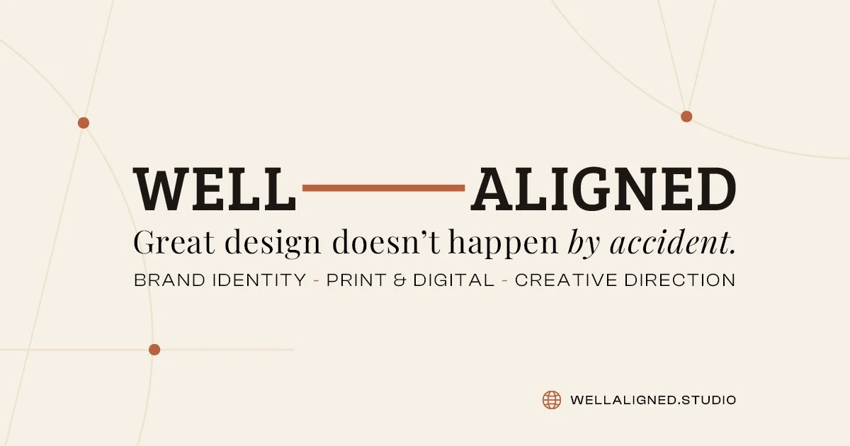
A New Chapter: Introducing Well Aligned Studio
Today, I am excited to introduce Well Aligned Studio. It is not about leaving that chapter behind. It is about building on everything I learned along the way and giving a name to the work, the philosophy, and the partnerships I want to continue building in the years ahead.
A message from the founder, Adam Hajnos.
For as long as I can remember, adamhajnos.com has been my little corner of the internet.
It started as a school portfolio in 2007. A place to send potential employers, showcase my work, and keep a living record of my career. Over time, it became much more than that. It grew into a freelance business, a place to share thoughts on design and creativity, and occasionally a space where I wrote about things far beyond work, like balancing client projects while chasing a toddler at home.
Looking back through those pages feels a bit like reading an old journal. I can see where I started, the risks I took, the mistakes I made, and, hopefully, some evidence of how I've grown. That is what makes this moment both exciting and a little bittersweet. Adamhajnos.com has represented an important chapter of my career, and I am incredibly grateful for everything it made possible.
Today, I am excited to introduce Well Aligned Studio. It is not about leaving that chapter behind. It is about building on everything I learned along the way and giving a name to the work, the philosophy, and the partnerships I want to continue building in the years ahead.
Finding Purpose in the Process
When I first started my career, I was fascinated by the craft of design. I wanted to create work that was beautiful, memorable, and maybe even worthy of an award or two.
Over the years, something shifted.
The projects I became most proud of were not necessarily the flashiest ones. They were the ones where everyone shared a clear definition of success from the very beginning. Together, we committed to the process, made decisions with purpose, and measured our work against real outcomes, not just whether everyone liked the design.
I have learned that many creative projects do not struggle because the designers are not talented. They struggle because no one ever defines what success actually looks like.
Without a shared goal, feedback becomes subjective. "Can we try another color?" "What if the logo were bigger?" "Something just does not feel right?" I have been part of those endless revision cycles more times than I can count, and they almost always lead to the same place: more opinions, more revisions, and less confidence that we are solving the right problem.
When everyone aligns around a clear objective, those conversations become much simpler. Design decisions stop being based on personal preference and start being based on purpose. We can ask better questions, make better decisions, and measure success against something real.
Somewhere along the way, I realized I was no longer interested in simply creating beautiful work. I became interested in helping solve problems, and that shift changed everything.
Why Well Aligned?
The name Well Aligned came from an idea that kept surfacing in almost every successful project I had been part of. As a designer, "alignment" is one of those words you use every day. It is about creating order, consistency, balance, and clarity. But over time, I realized the most important alignment happens long before anyone opens a design file. It happens when everyone agrees on the problem they are trying to solve, who they are solving it for, and what success actually looks like.
Once those things are aligned, the design process changes completely. Conversations become more productive, decisions become more intentional, and design stops being about personal preference. Instead, it becomes a tool for solving problems and moving the business forward. That double meaning is what ultimately sold me on the name. Well Aligned Studio reflects the belief that the best work happens when strategy, design, technology, business goals, and the people behind them are all working toward the same outcome.
It Is Still Me
The biggest thing I want people to know is that this is still me. You will still email me. We will still brainstorm together. I will still be the one asking questions, sketching ideas, and obsessing over the details until everything feels right. What is changing is not who you are working with, but how I think about the work. Well Aligned Studio gives a name to an approach that has been evolving for years. It is about giving a home to a philosophy that has become central to how I work.
Looking Back With Gratitude
As I look back on everything that lived under adamhajnos.com, I realize it has been much more than a portfolio. It has been a journal of my career. Every project represents a moment in time, every case study reminds me of a lesson learned, and every client reflects someone who trusted me with their business, their brand, and their vision. Looking through those projects today, I can see my own evolution, from a designer focused on creating beautiful work to a creative strategist focused on solving meaningful business problems. I would not be here without the mentors who shaped how I think, the coworkers who challenged me, and the clients who believed in me.
That is why this does not feel like leaving something behind. Well Aligned Studio is simply the next chapter in a story that has been unfolding for years. To everyone who has followed along, hired me, collaborated with me, challenged me, or simply encouraged me along the way, thank you. Your trust has shaped both my career and the way I approach this work, and I could not be more excited for what comes next.
If you would like to follow along, I would love for you to visit wellaligned.studio and connect with Well Aligned Studio on LinkedIn.