How Do You Design a Brand for a Global Audience?
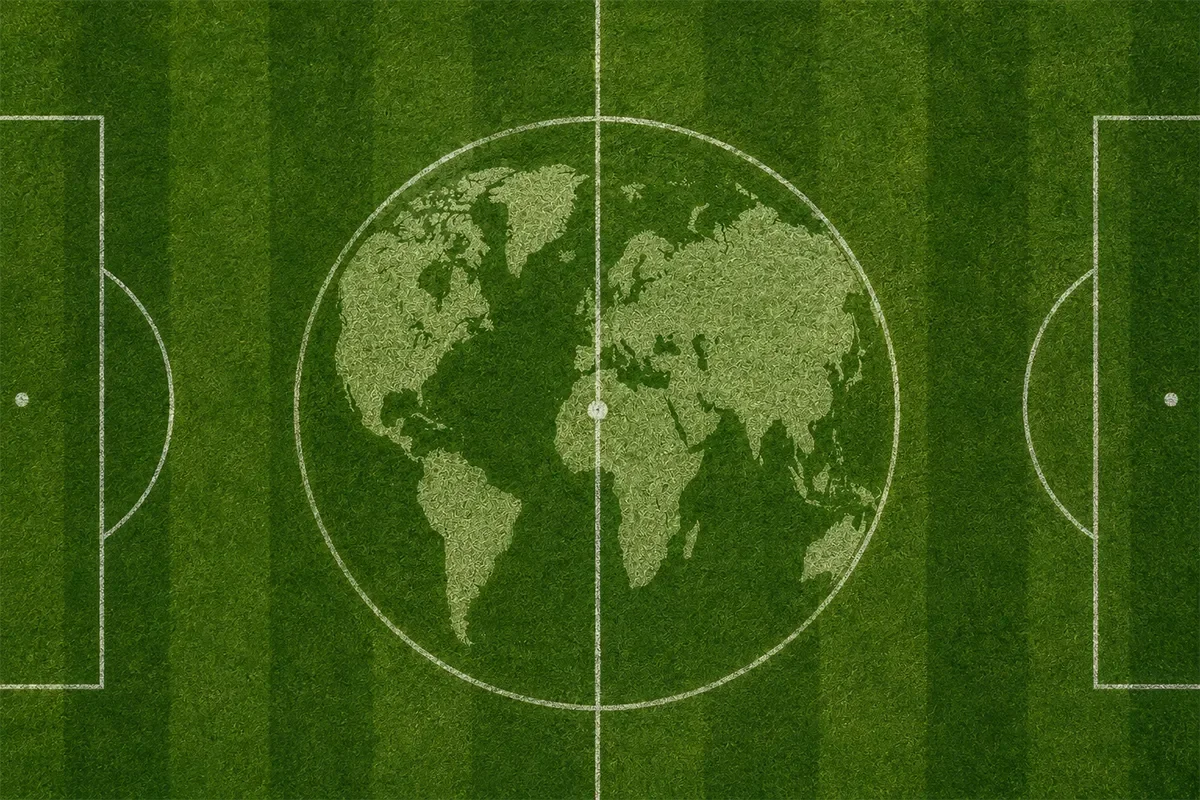
What the FIFA World Cup 2026 identity can teach every organization about designing for multiple languages, cultures, and billions of people.
Key Takeaways
Global brands must work across multiple languages, writing systems, and cultures.
Typography is one of the most important decisions in an international brand system.
Successful identities perform consistently across digital, print, merchandise, signage, and broadcast.
Accessibility, production methods, and technology limitations influence design decisions.
Strong brand systems solve practical problems before they create visual excitement.
Introduction
When most people see a global brand launch, they notice the logo.
Designers see something much bigger.
Events like the FIFA World Cup 2026 require visual identities that work across three countries, sixteen host cities, dozens of languages, countless production methods, and billions of viewers. The logo is only one small part of a much larger system designed to communicate consistently under almost any condition.
Whether you're branding a local business or one of the world's largest sporting events, many of the same design principles apply.
Why Is Designing for a Global Audience So Challenging?
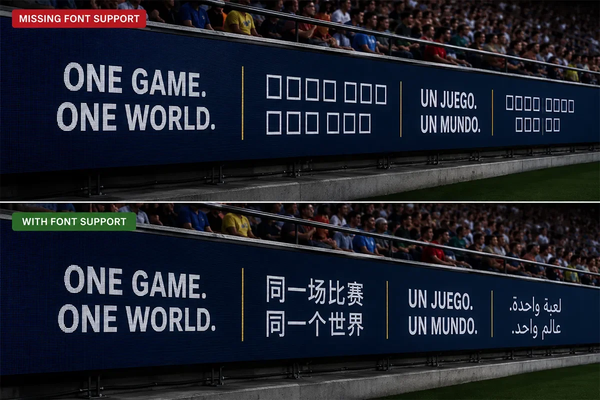
A local business may have one website, one language, and a handful of marketing materials.
A global event operates on an entirely different scale.
The FIFA World Cup 2026 identity needs to appear consistently across stadium signage, broadcast graphics, merchandise, mobile apps, social media, transportation systems, security credentials, tickets, volunteer uniforms, sponsor activations, and city wayfinding. Every application introduces different technical and environmental constraints.
The challenge isn't creating something that looks impressive in a presentation. It's creating something that works everywhere.
Why Typography Matters More Than Most People Realize
Most people associate branding with logos.
For international organizations, typography often does much more of the heavy lifting.
A global typeface needs to support multiple writing systems, hundreds of characters, accent marks, and special symbols while remaining legible across digital and physical environments.
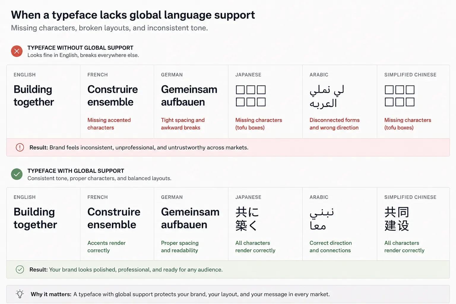
It also needs to account for language expansion. A headline that fits neatly in English may require significantly more space in German, French, or Spanish. In other regions, text may flow in entirely different directions or require completely different character sets.
Good typography creates consistency long before anyone notices it.
Why Every Surface Matters
A successful identity isn't designed for one application.
It's designed for thousands.
The same visual system must perform equally well on:
Stadium scoreboards
Mobile apps
Television broadcasts
Embroidered apparel
Security credentials
Printed tickets
Vehicle graphics
Building signage
Social media
Merchandise
Each surface changes how people experience the brand. The identity needs to remain recognizable whether it's viewed from 300 feet away or held in someone's hand.
Designing for Different Levels of Technology
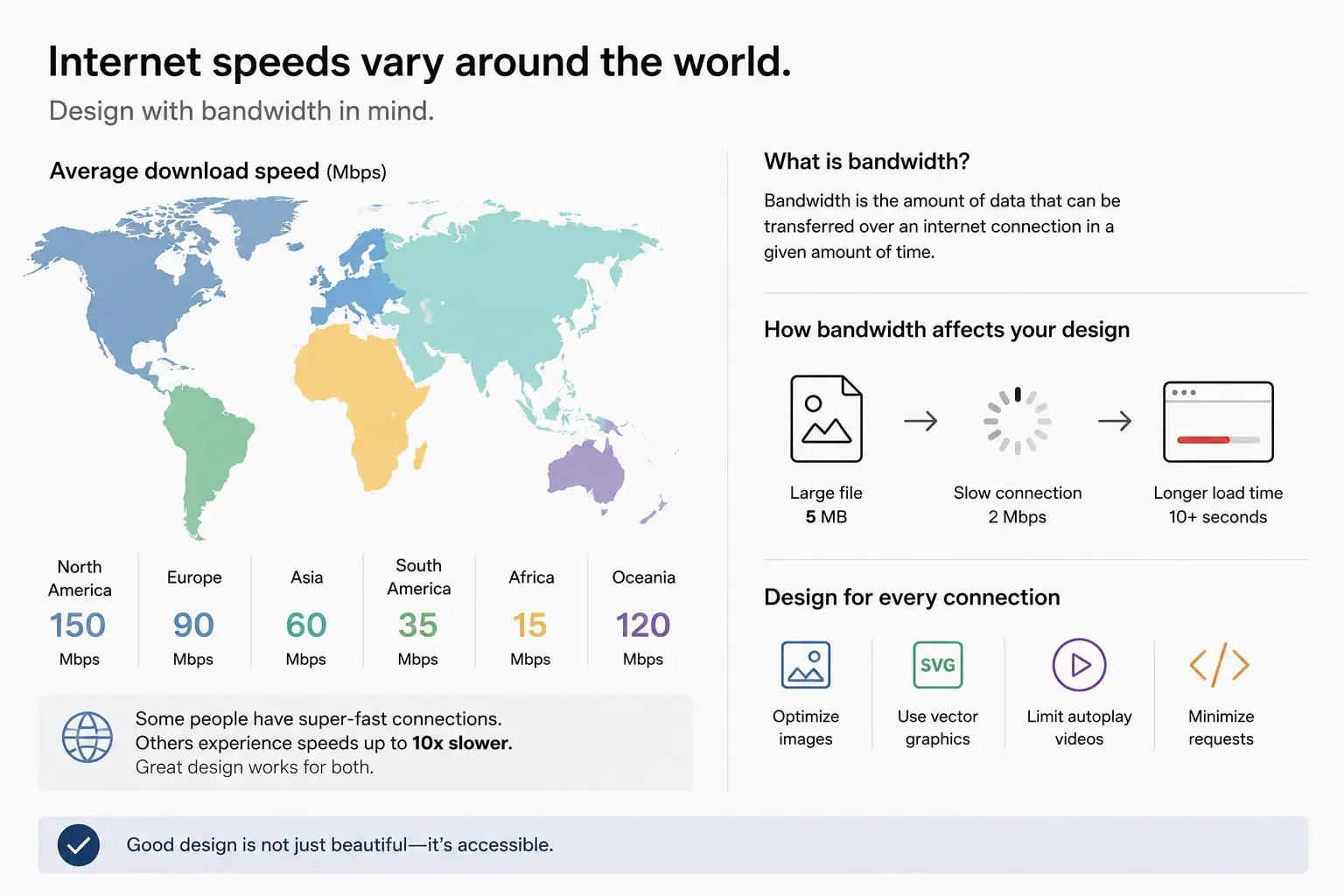
One challenge that rarely gets discussed is technology itself.
Not every fan watches matches on a 4K television or the latest smartphone connected to high speed internet.
Many people experience international events through older mobile devices, slower cellular networks, compressed social media images, or public displays with limited resolution.
These realities influence design decisions.
Simpler graphics load faster. Clear typography remains readable after image compression. Lightweight digital assets improve accessibility for audiences around the world.
Sometimes simplicity isn't an aesthetic choice. It's a performance requirement.
Accessibility Is Part of Good Design
Global brands don't design for an average user.
They design for everyone.
That means considering:
Color contrast
Minimum type sizes
Readability at distance
Color blindness
Motion sensitivity
Clear iconography
Legible wayfinding
Digital accessibility standards
Accessibility improves the experience for every audience, not just those with specific needs.
Consistency Across Thousands of Contributors
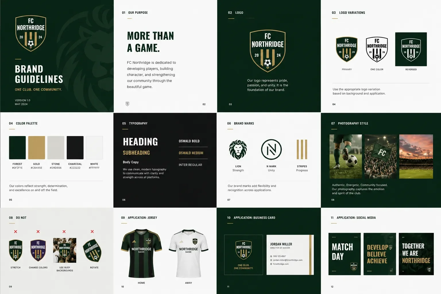
One design team doesn't create every World Cup asset.
Eventually, the brand is used by host cities, broadcasters, sponsors, printers, merchandise vendors, volunteers, venue operators, and marketing teams around the world.
Without a strong design system, consistency quickly disappears.
That's why successful global brands invest as much in standards, templates, and documentation as they do in creative exploration.
A well designed system empowers thousands of people to create work that still feels like one brand.
What Businesses Can Learn from FIFA World Cup 2026
Most organizations don't need to communicate across dozens of languages or hundreds of venues.
But they do face similar challenges at a smaller scale.
As companies grow, their brands appear on websites, proposals, presentations, trade shows, social media, email campaigns, signage, sales materials, and internal communications. Without a cohesive visual system, those experiences begin to feel disconnected.
The lesson isn't to design like FIFA.
The lesson is to build a brand that can grow without losing consistency.
Frequently Asked Questions
What makes a global brand successful?
A successful global brand communicates consistently across languages, cultures, media, and production methods while remaining recognizable in every application.
Why is typography important in international branding?
Typography must support multiple languages, maintain readability across different devices and print methods, and accommodate varying text lengths without breaking layouts.
Why are many global logos relatively simple?
Simple marks are easier to reproduce across signage, apparel, digital platforms, merchandise, and broadcast graphics while remaining recognizable at any size.
What is a brand system?
A brand system is the collection of visual elements, rules, templates, and guidelines that ensure a brand is applied consistently across every touchpoint.
Final Thoughts
The FIFA World Cup 2026 identity isn't remarkable because of a single logo.
It's remarkable because it solves an incredibly complex communication challenge.
Designing for billions of people requires clarity, flexibility, and consistency across languages, technologies, cultures, and environments. Those same principles apply to organizations of every size.
The strongest brands aren't the ones with the cleverest logos. They're the ones that continue to work wherever people encounter them.