America250 Shows the Difference Between a Logo and a Brand System

When a project spans an entire nation, hundreds of organizations, and years of implementation, a good logo simply isn't enough. The identity has to work everywhere, across every medium, while remaining instantly recognizable no matter who is creating the next piece of communication.
That is exactly what makes the America250 identity so successful.
Designed by Chermayeff & Geismar & Haviv, the visual identity for the United States' 250th anniversary celebration has generated plenty of conversation since its launch. While public discussion often centers on whether someone likes the logo itself, that question misses the bigger achievement. The real success isn't the mark. It's the design system built around it.
Looking Beyond the Logo
As designers, it's easy to appreciate a logo in isolation. Clients, however, rarely experience brands that way. They encounter websites, social media posts, event signage, presentations, merchandise, exhibits, advertising, environmental graphics, and countless other touchpoints. A logo might appear on all of those pieces, but it cannot carry the entire brand by itself.
The America250 identity understands that from the beginning.
The ribbon that weaves through the "250" isn't simply a decorative flourish. It becomes a flexible visual language that extends across the entire identity. Sometimes it frames photography. Sometimes it creates movement through a layout. In motion graphics it guides transitions. On environmental graphics it helps define space. Across every application, it provides continuity without requiring every piece to look exactly the same.
That flexibility is what separates a logo from a true brand system.
A System Built to Scale
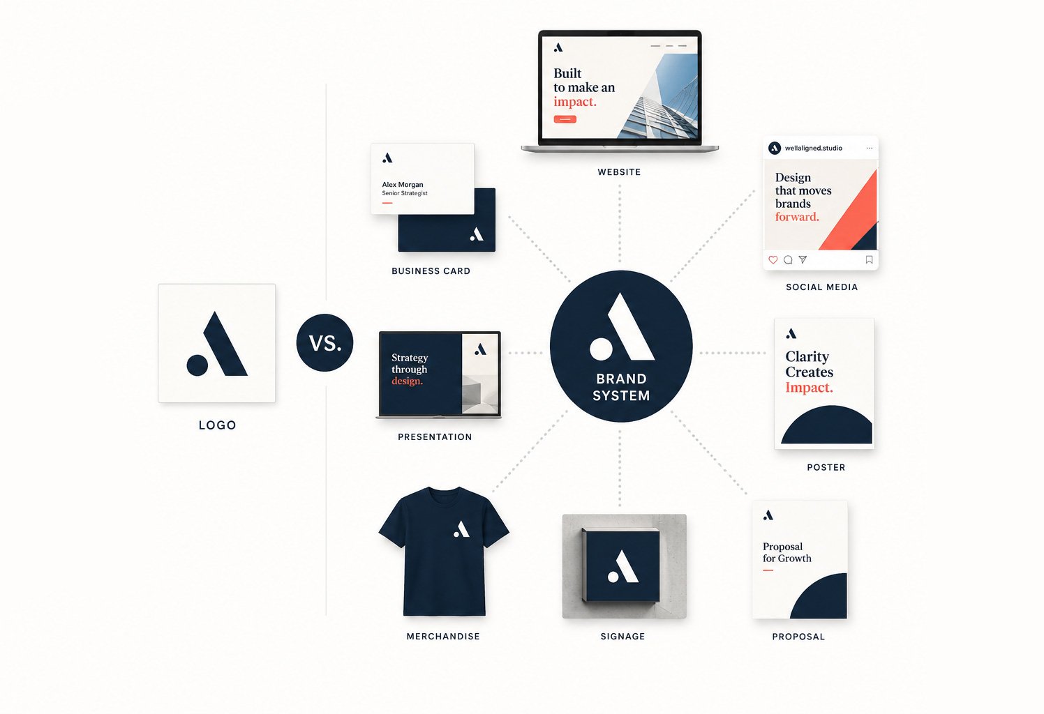
One of the most difficult challenges in branding is creating consistency without creating repetition. Organizations naturally evolve over time. New campaigns launch, new vendors become involved, and internal teams create their own materials. If the only brand asset is a logo, those pieces quickly begin to feel disconnected.
Strong visual identities solve this by providing a toolkit rather than a single asset. Typography, color, graphic elements, layout principles, photography, iconography, and motion all work together to create recognition. The logo simply becomes one part of a much larger system.
America250 is an excellent example of this philosophy in practice. The identity feels cohesive whether it appears on a website, a commemorative poster, merchandise, educational materials, or large scale event graphics. Each application has room to breathe while still feeling unmistakably connected to the overall brand.
That's a remarkably difficult balance to achieve, especially for an initiative that will involve countless designers, agencies, partners, and organizations over multiple years.
Why This Matters for Every Brand
You don't have to be leading a nationwide initiative to benefit from this approach.
Whether you're a nonprofit, healthcare organization, professional services firm, or growing business, your brand will eventually need to live in far more places than your logo. Marketing materials, proposals, social media, presentations, websites, trade shows, email campaigns, and internal communications all become part of your brand experience.
A strong visual identity makes those applications feel connected without forcing every piece to look identical.
Instead of asking, "Where should we put the logo?" teams begin asking, "How do we use our brand system?" That shift creates consistency naturally rather than through rigid rules.
More Than a Style Guide
This is one of the reasons we encourage clients to think beyond logo design. A logo is an important investment, but it is only the starting point. The real value comes from building a visual system that makes every future piece of communication easier to create and more consistent to recognize.
When a marketing team sits down to build a presentation, publish a social campaign, design event signage, or launch a new website, they shouldn't have to reinvent the brand each time. The system should already provide the building blocks. Brand guidelines become less about restricting creativity and more about enabling it.
The Takeaway
The America250 identity is a reminder that the strongest brands aren't necessarily the ones with the most intricate logos. They're the ones that create a visual language capable of growing across hundreds of applications while maintaining clarity, flexibility, and recognition.
A logo introduces the brand.
A well designed brand system allows it to grow.