BRAND / IDENTITY / PRINT / WEB
A full spectrum brand for movement, recovery, and community.
CLIENT
overflo studios
INDUSTRY
Fitness, Lagree, Pilates, wellness, and recovery
SERVICES
Brand identity, messaging, website, signage, merchandise, social templates, launch materials, and print production
A luxury fitness studio brand with energy.
Overflo studios began with a strong idea: create more than a place to take a class. The founders envisioned a full spectrum movement and recovery studio where members could work out, reset, reflect, socialize, recover, and build community.
They knew the audience they wanted to attract and had a clear vision for the experience. What they needed was a creative partner who could turn those ideas into a complete brand and launch system.
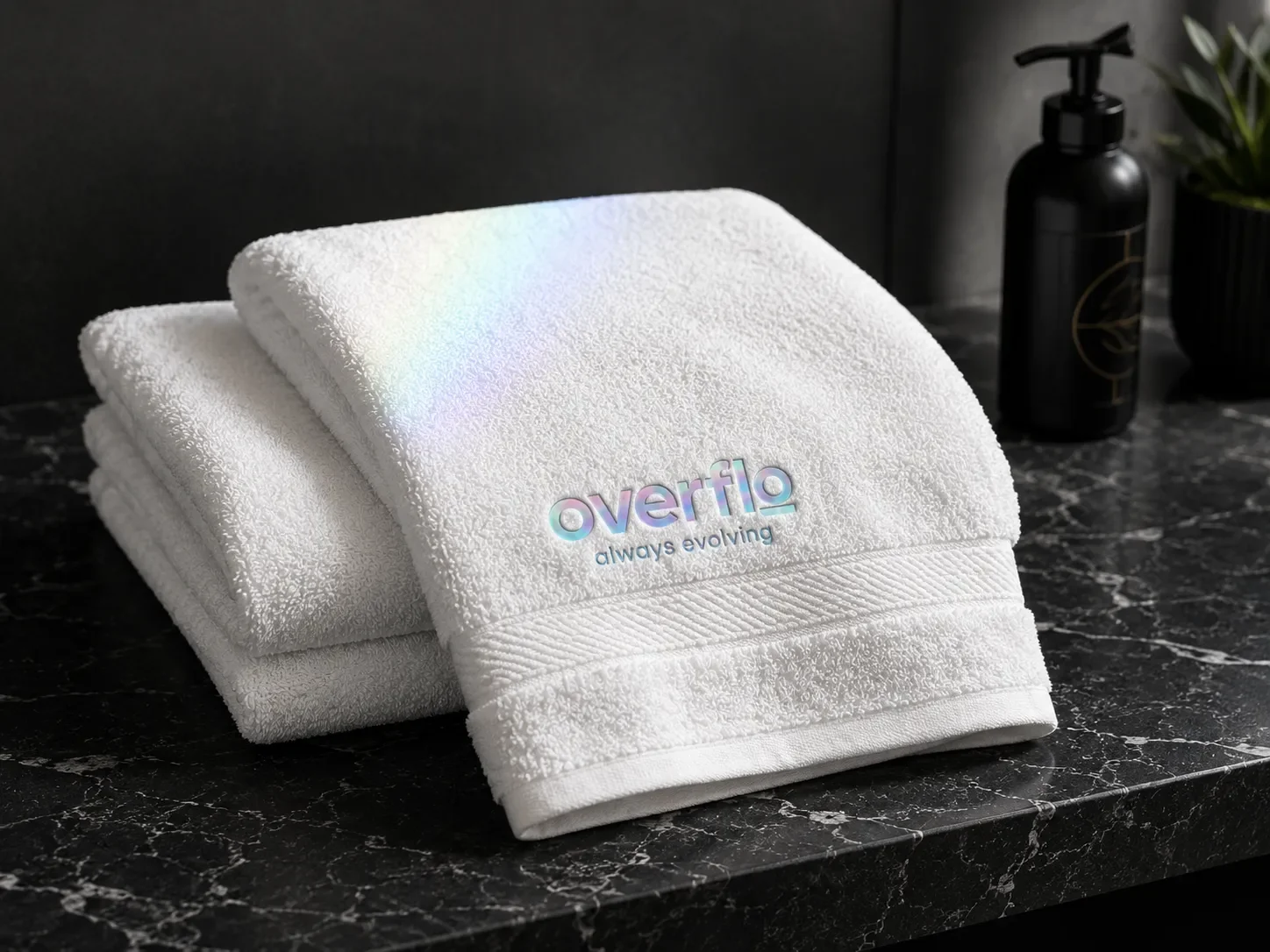
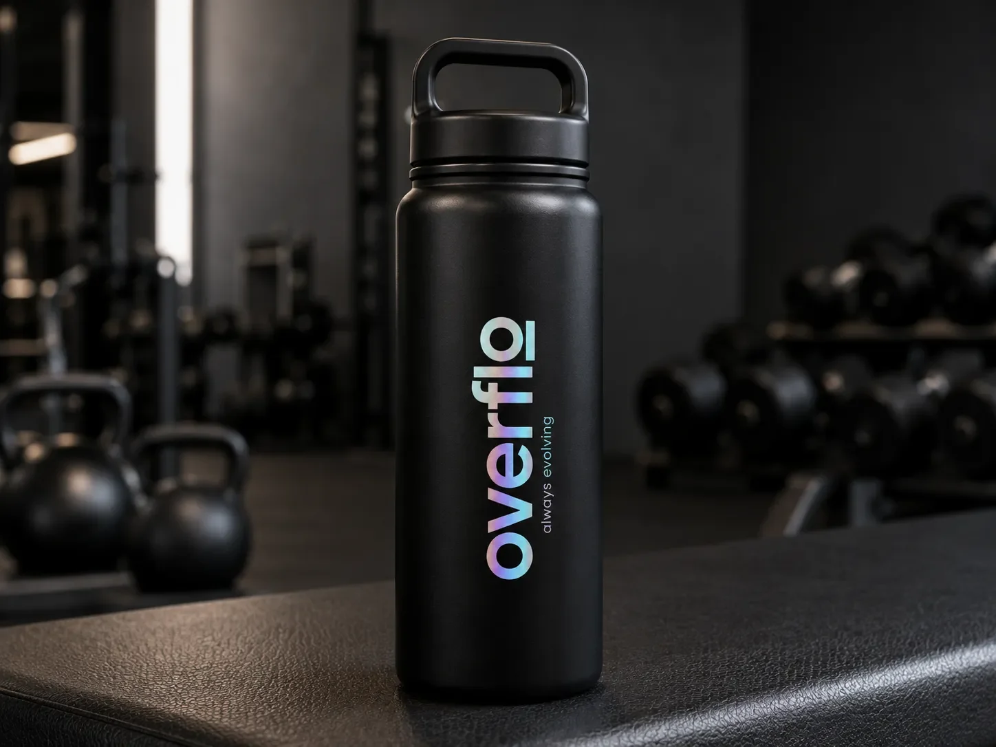
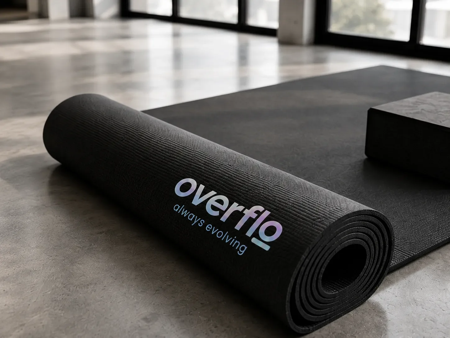
Well Aligned Studio developed the logo, visual identity, brand guidelines, messaging, website, signage, merchandise, launch materials, and print production.
The Challenge
A strong vision that had not been captured ...yet
The founders came to WAS after two previous branding attempts that missed the mark. The concepts felt generic, visually underdeveloped, and too focused on the obvious cues of a fitness or Pilates studio. They lacked the spark, energy, and elevated quality that were central to the business.
The challenge was not finding the vision. It was translating a very specific point of view into a clear, flexible identity that felt luxe without becoming quiet, sterile, or predictable.
As experienced business leaders launching their first small business, the founders also needed guidance through a process they had never managed before. WAS led kickoff sessions, moodboards, concept development, regular check ins, and production planning so each decision supported the larger launch.
Visual Identity
A full spectrum reset.
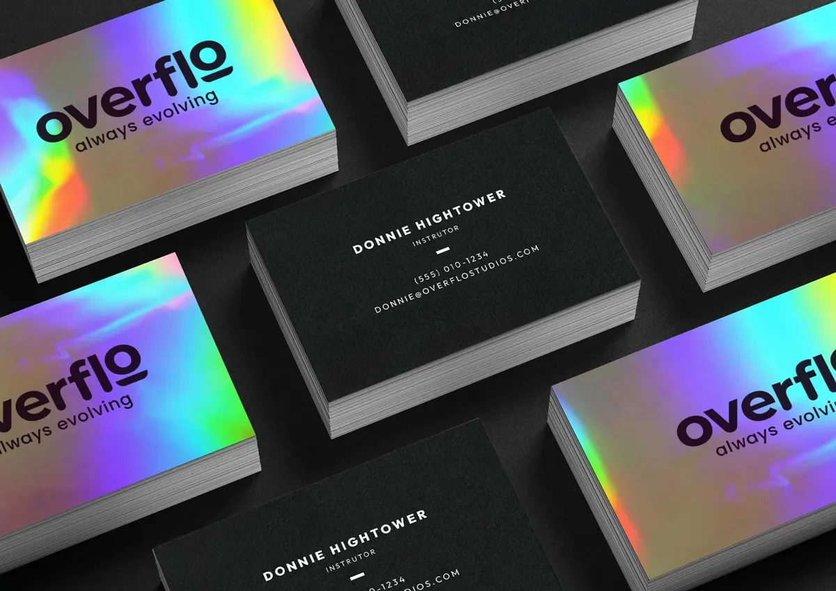
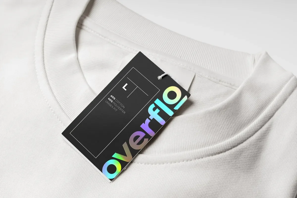
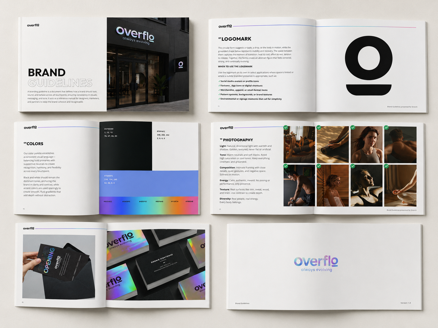
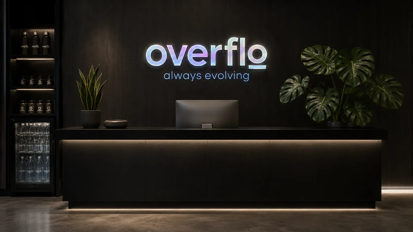
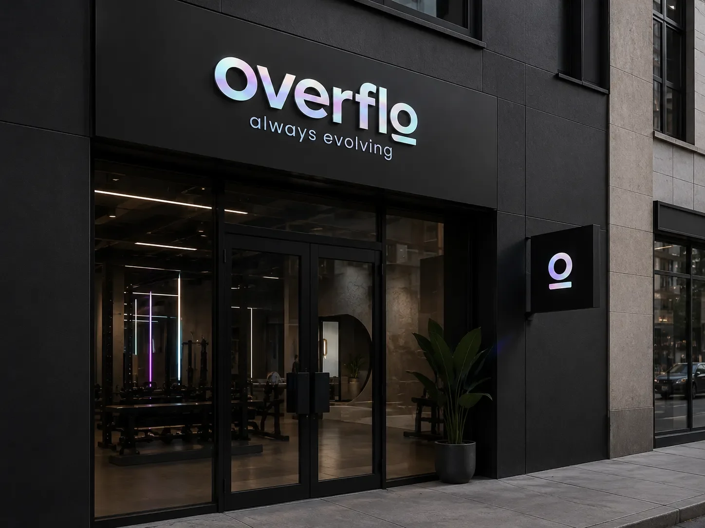
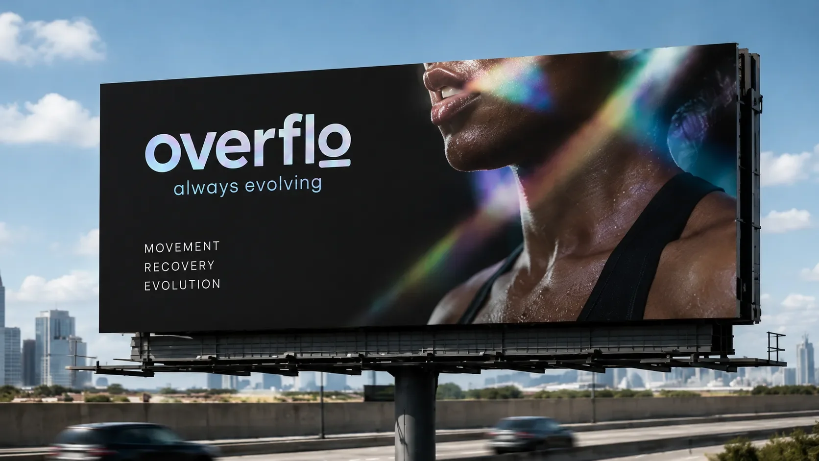
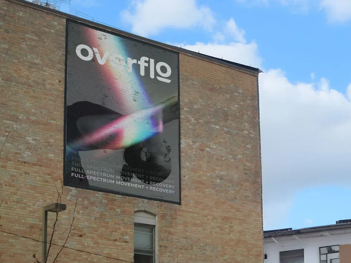
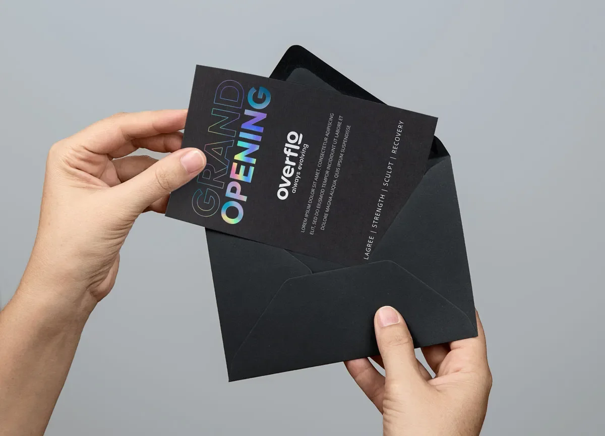
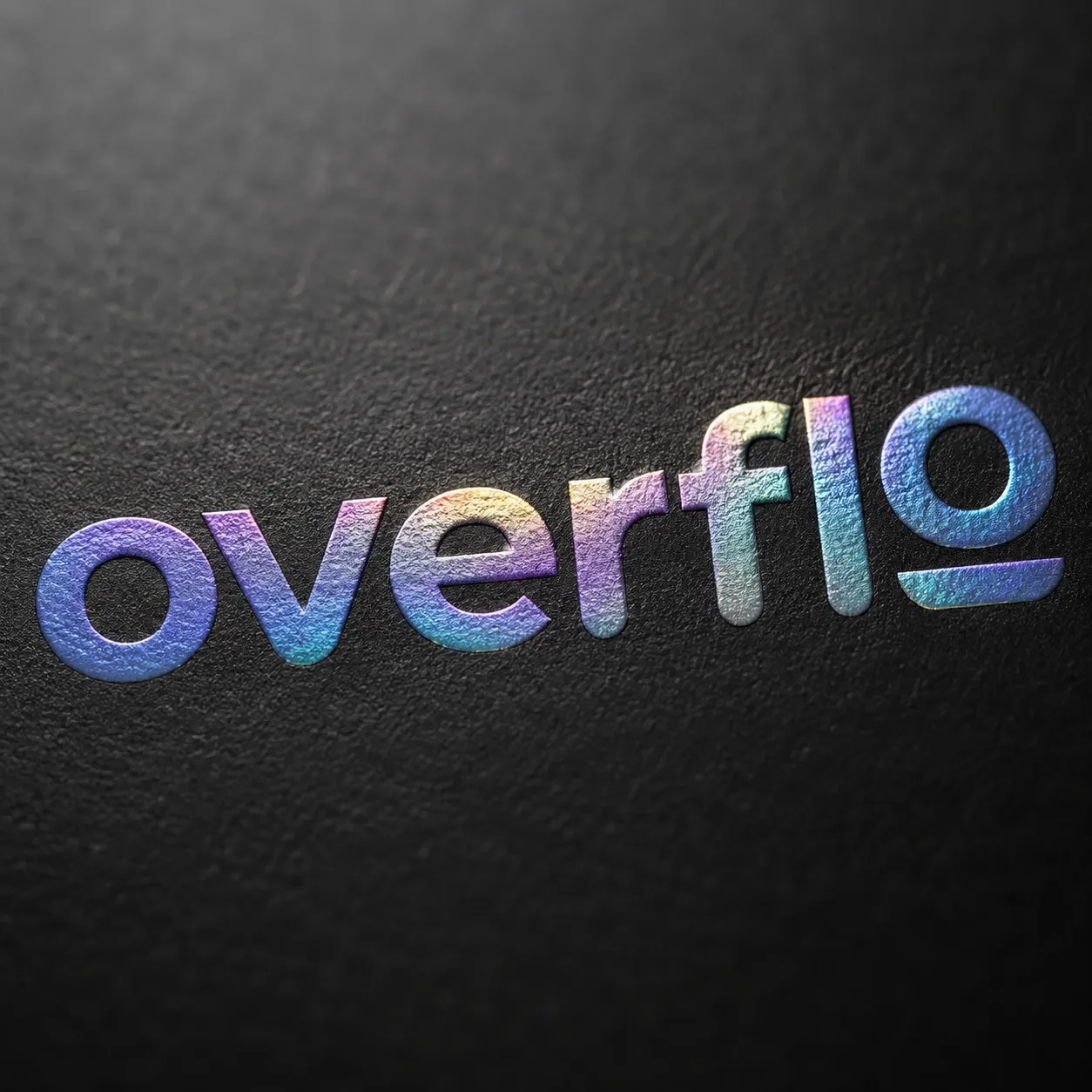
The idea of a full spectrum reset became the foundation of the brand. Black and white created a grounded, premium base. Holographic finishes introduced shifting color, movement, and energy.
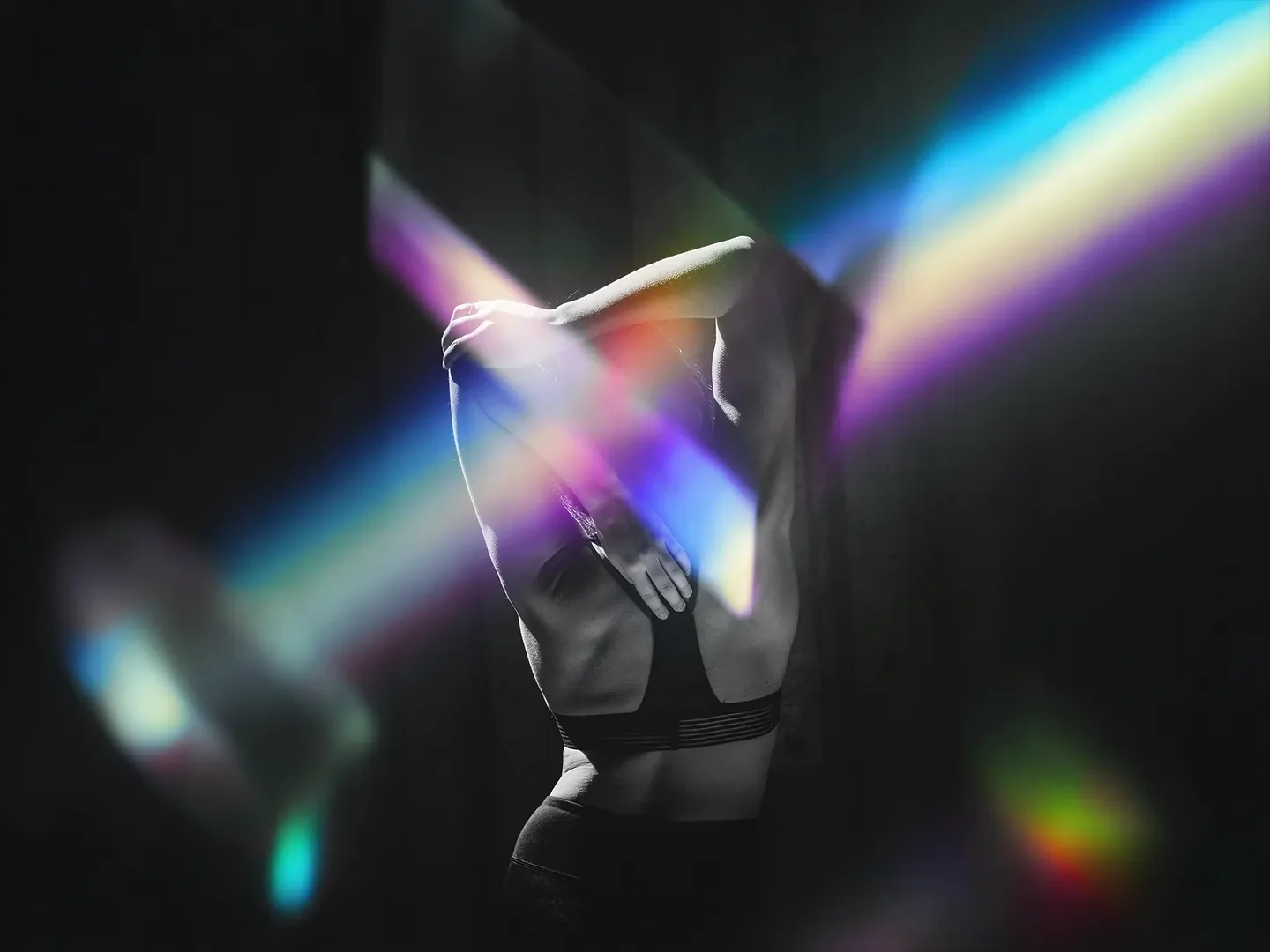
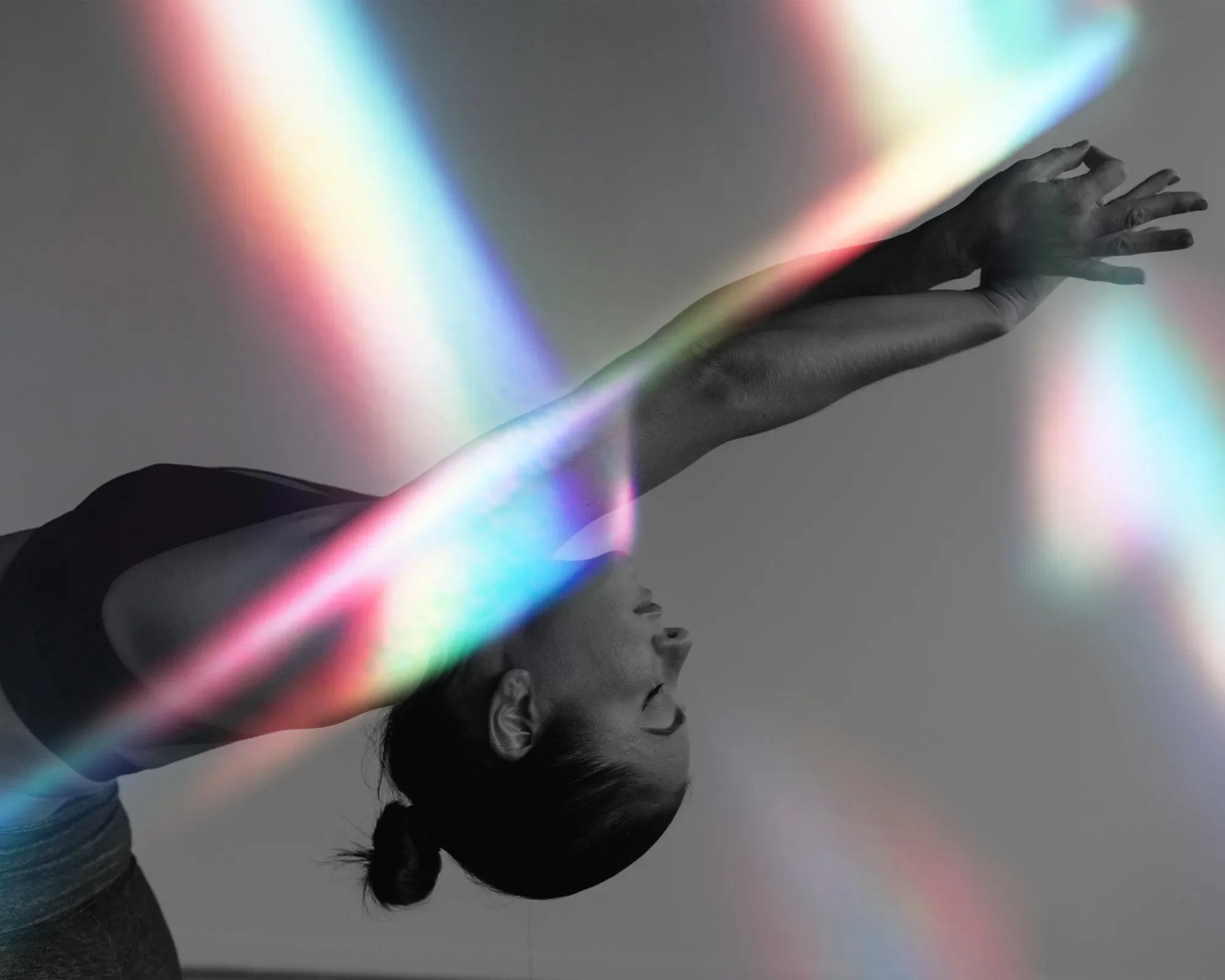
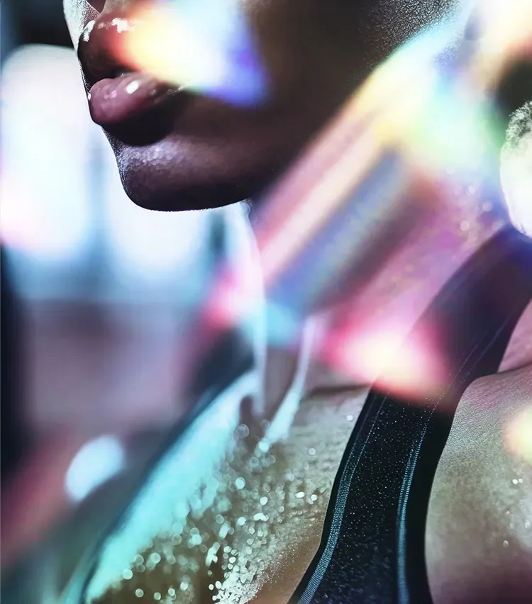
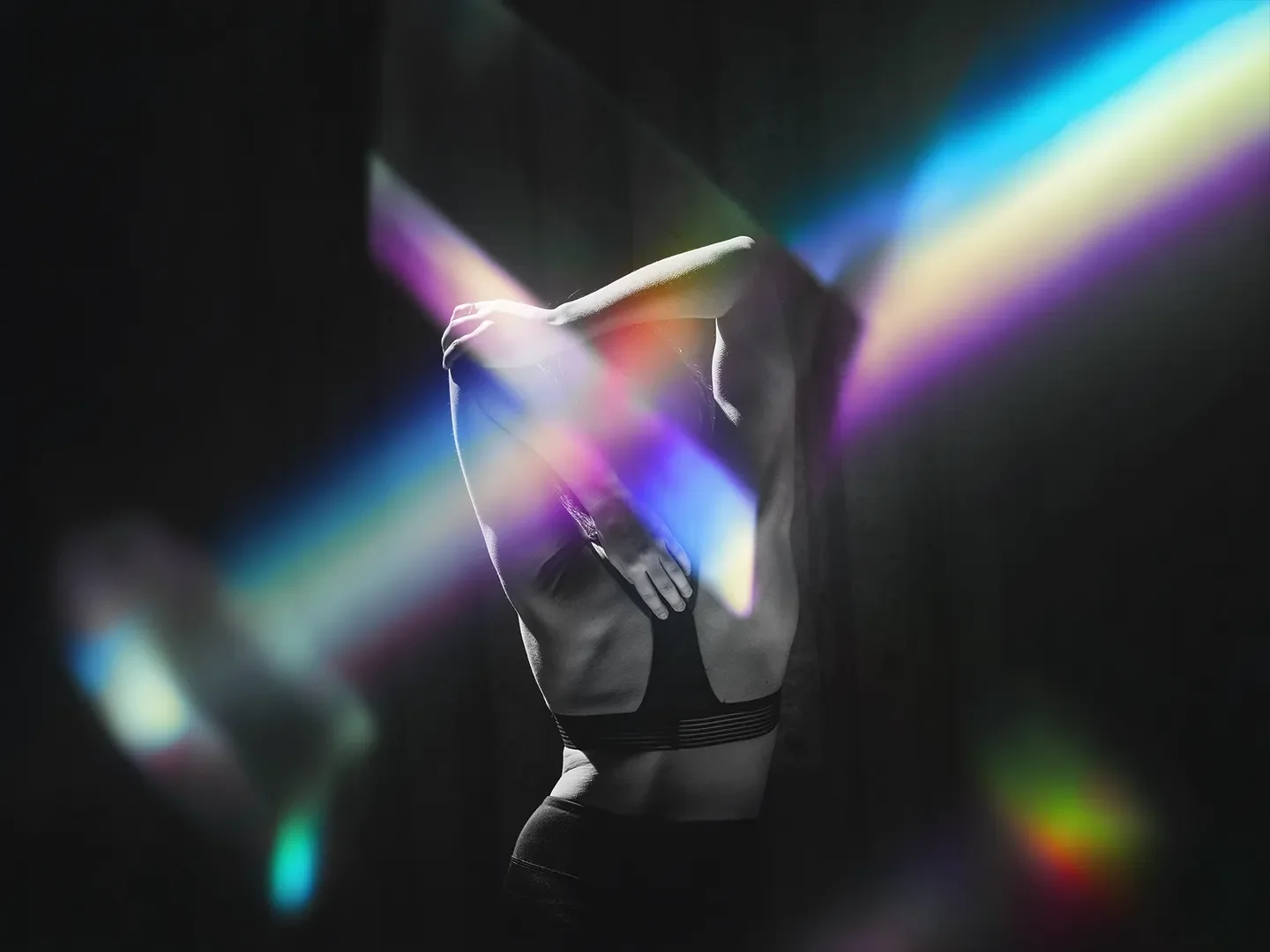
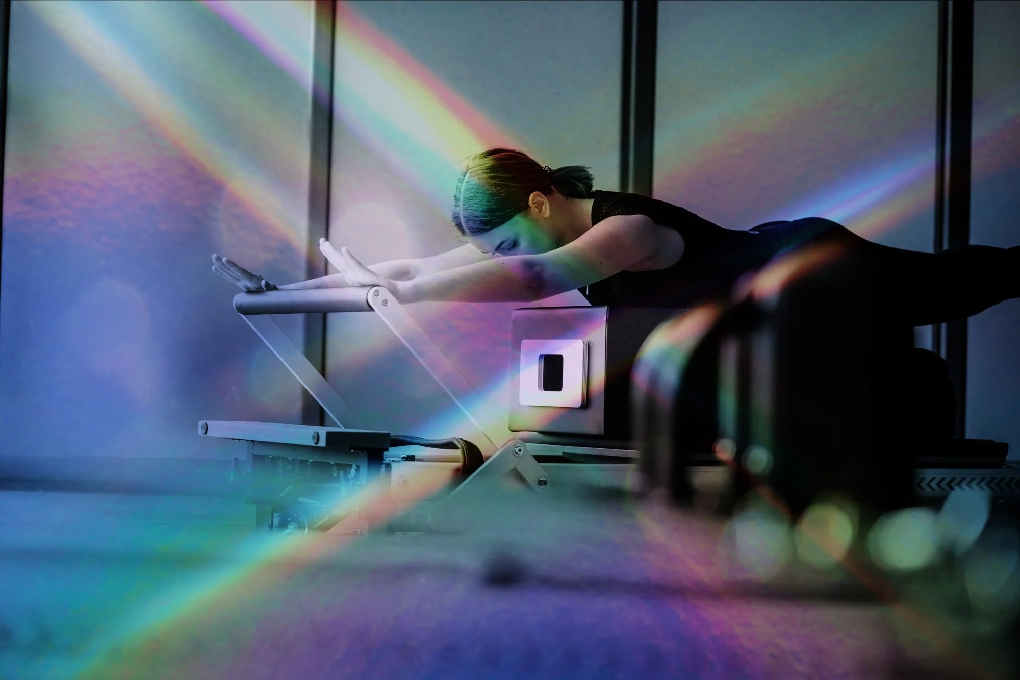
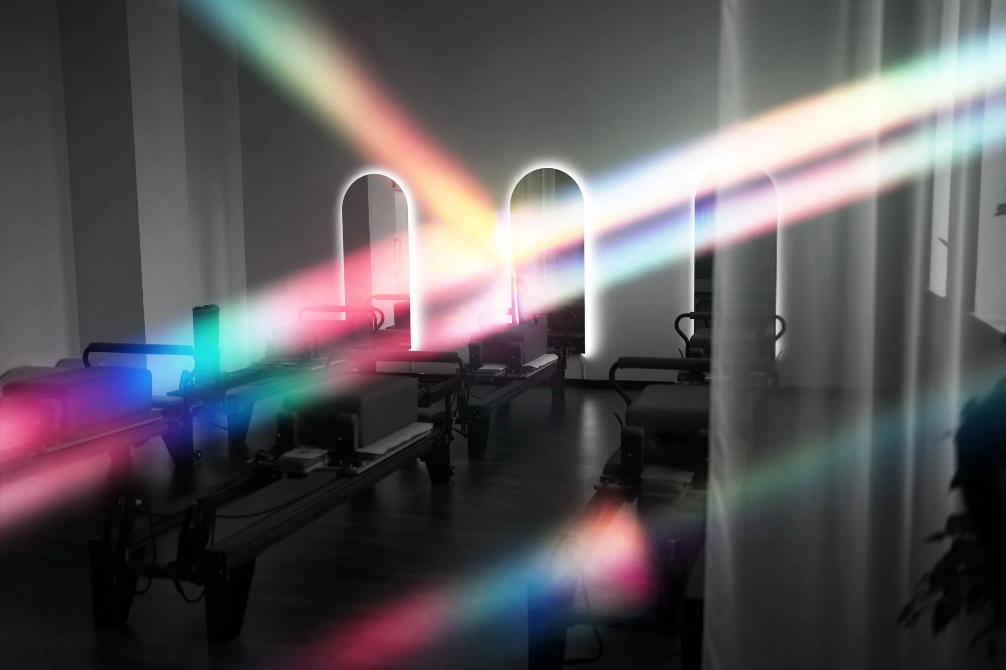
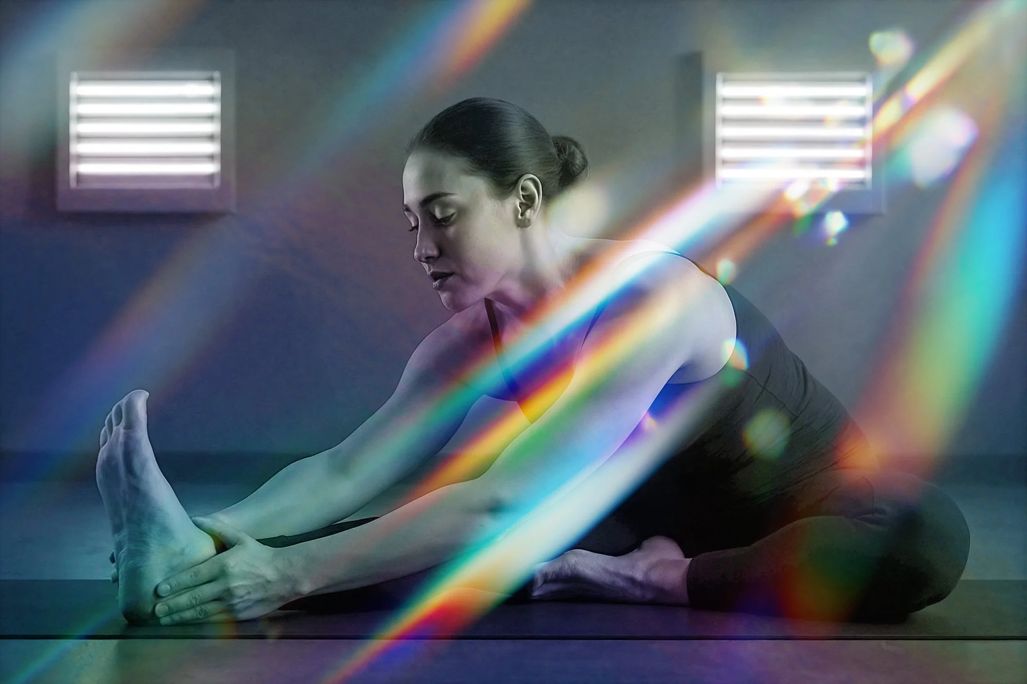
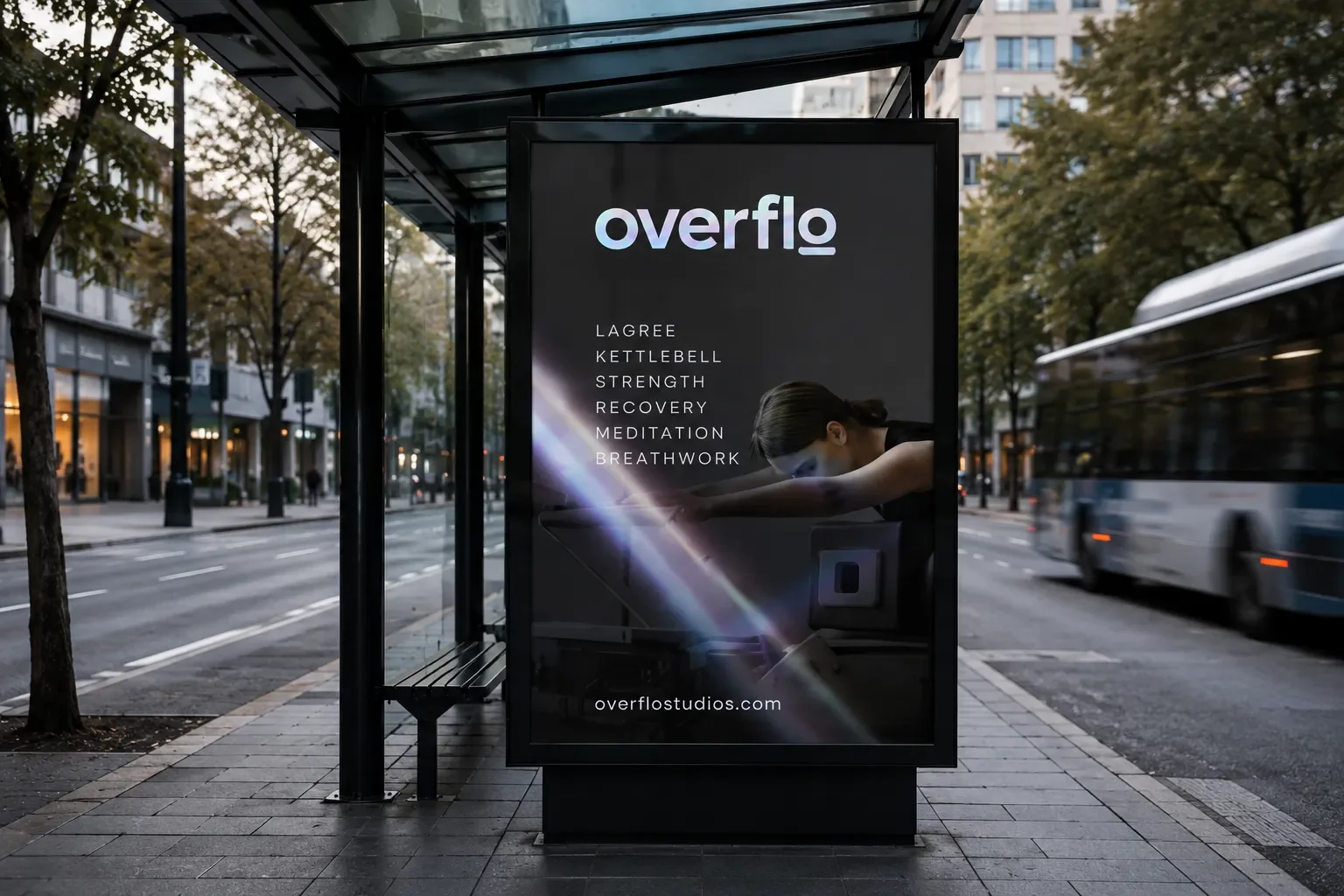
The signature photography style paired high contrast black and white imagery with prismatic light. The photography communicated strength, focus, and human movement, while the prismatic effects suggested transformation and the energy surrounding the physical experience.
Together, the system balanced movement and recovery, energy and stillness, structure and flow, luxury and accessibility.
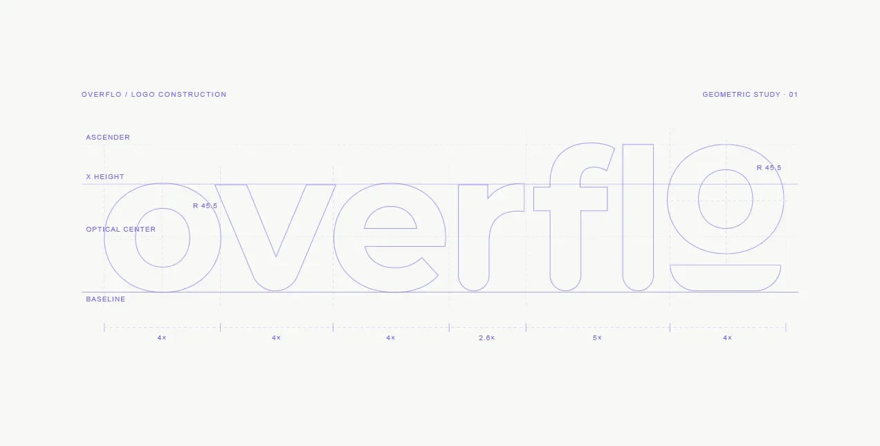
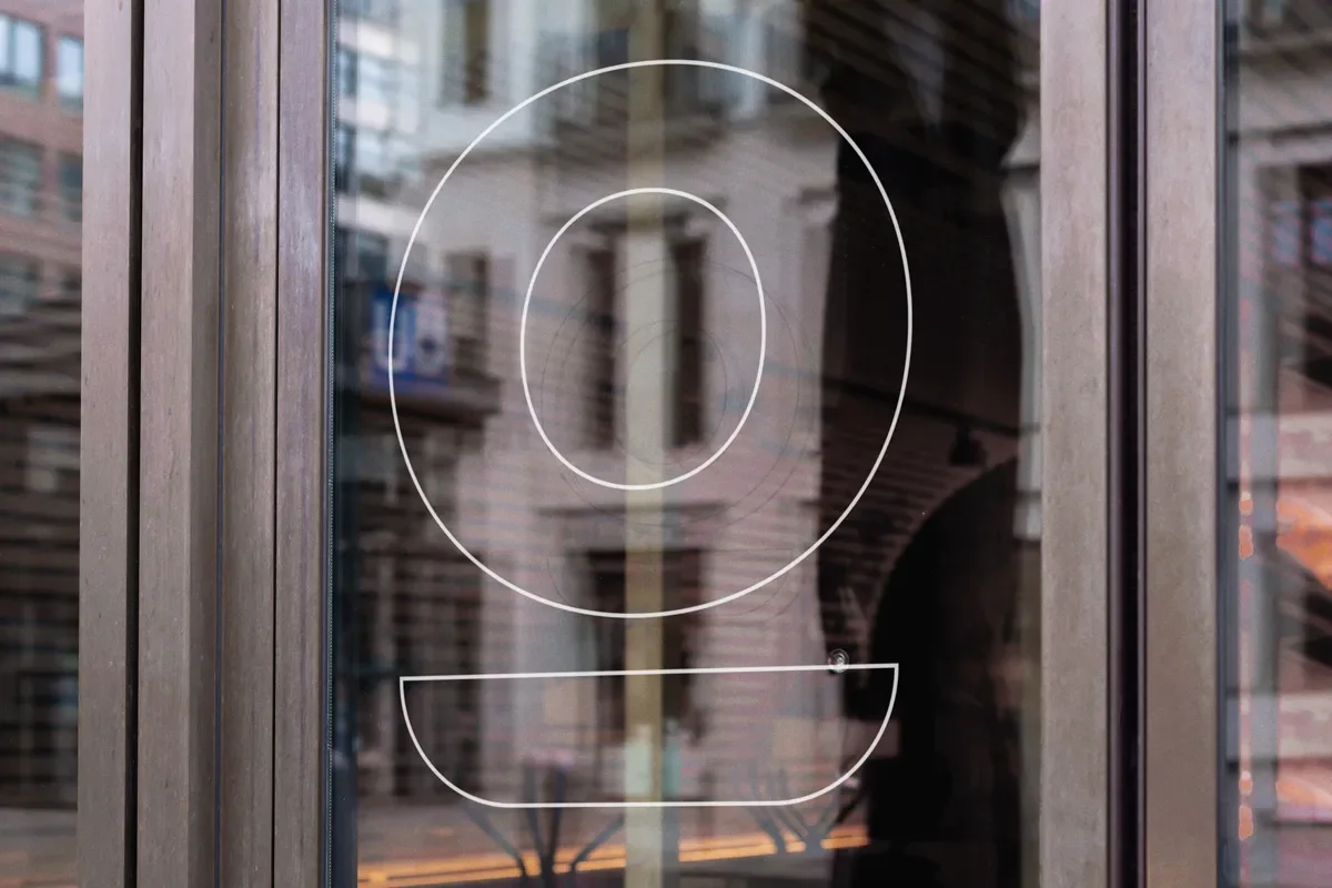
The logo remained intentionally simple. When conversations moved toward longer taglines or additional elements, WAS recommended restraint. The logo needed to stay clear across storefront signage, merchandise, social graphics, digital interfaces, and small applications. The expressive energy could live in the larger visual system.
Website
Building the launch platform.
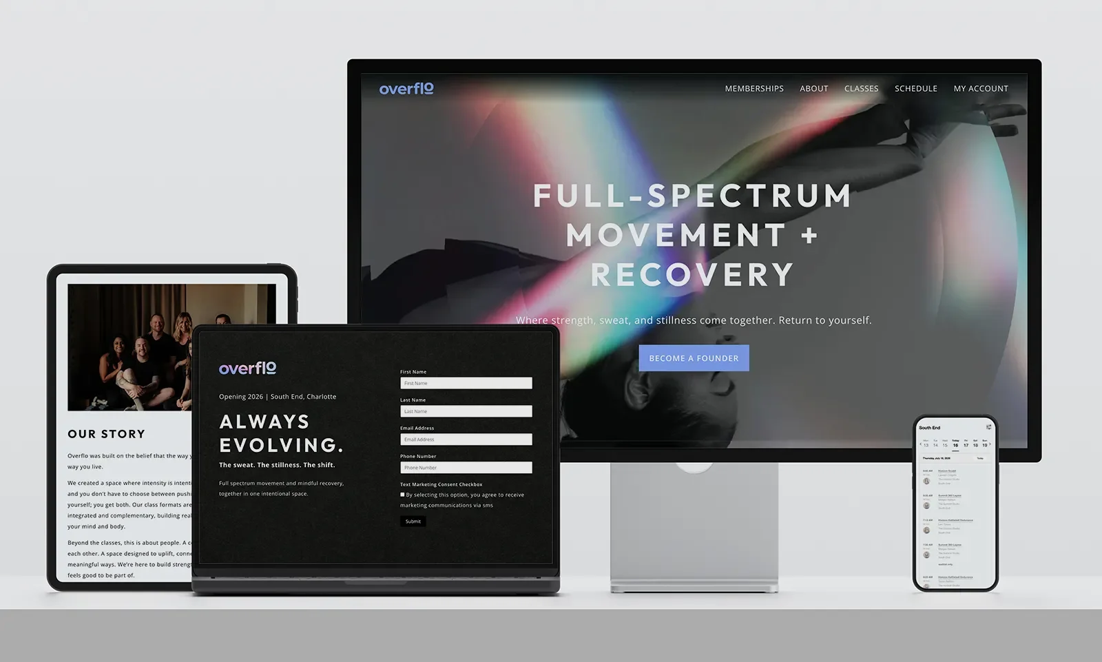
The website was central to the launch strategy. It began as a focused landing page that introduced the concept, collected contact information, built a waitlist, and helped the founders gauge demand.
That waitlist became the audience for early access membership releases. As opening approached, the site expanded into a full customer platform that explained the studio experience, supported membership sales, and connected with the studio app for accounts, schedules, and bookings.
WAS also refined the copy and ideas supplied by the founders into a consistent brand voice across the website, social content, signage, and launch materials.
The Results
The visual direction was approved quickly with very few revisions. After two disappointing branding experiences, the founders finally saw their vision translated into an identity that felt distinct, elevated, and alive.
Four waves of early access memberships sold out in under an hour. Social growth remained steady, popup events with custom printed merchandise helped build an early community, and the studio generated strong press and positive feedback.
Ready to evolve your brand?
Whether you’re rebranding a global company or starting from the ground up, let’s talk about making it manageable.